Portrait Unit: Connotations of colour.
AO1: Contextual Understanding.
Developing ideas through sustained and focused investigations informed by contextual and other sources, demonstrating analytical ad critical understanding.
Brainstorm
|
Idea Sheet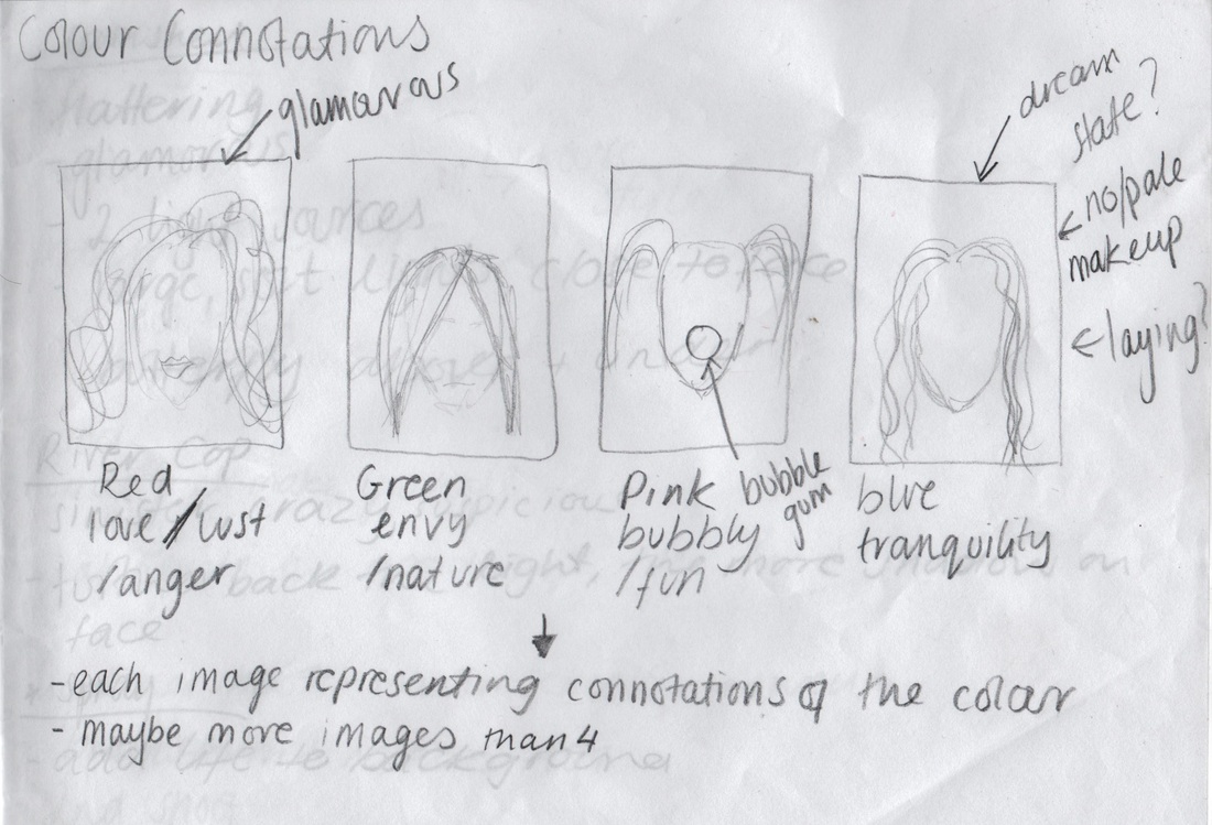
|
Photographer research.
Martin Schoeller.
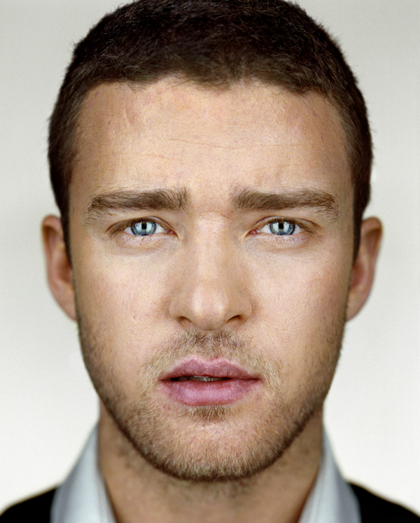
Through Martin Schoellers work, he brings out each of his models personal features, which creates a personal tone to the image as everyone has their own attributes that no-one else can share with them. His images all reveal the same outcome of brightness, though his portraits are never washed out or over exposed through how he lights them. His images also produce reflections of lights in the eyeballs, called catch lights, which sometimes to me can look very cat-like, but if done unsuccessfully, may ,make the eyes look cross-eyed.


Through this image, Schoeller has revealed the delicate nature of his subject. By using soft lighting which makes her face appear extremely soft therefore reveals a glow about her - she looks as if she were a pixie or fairy. The lightheartedness of this portrait also contributes to this factor. Her make-up, though very subtle is noticeable an frames hers eyes to influence the catch lights in her eyes to look more striking and beautiful.
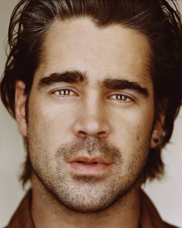
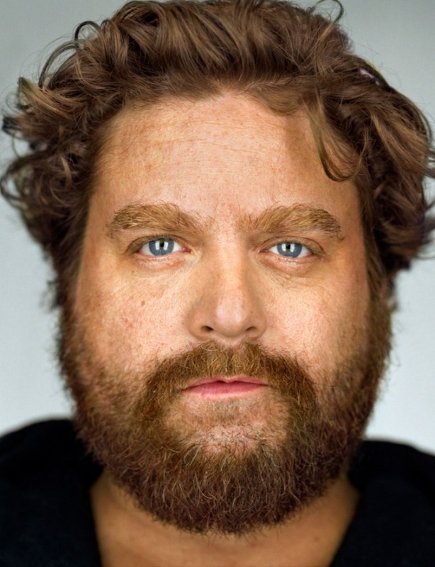
In this portrait, the models head seems to be the only part of the image in focus, while normally all areas of Schoellers portraits are focused. This blurred look around his face influences the roughness of his beard and doesn't make his hair look matted and sleek either. I think the catch lights in this image are more interesting than the previous image as his eyes are blue, which show a tone different from the rest of the image and therefore stand out. His age is shown in this photo, while he is not old he is older than the female model above, and it its noticeable through the wrinkles that have been revealed on his forehead. Every contour of his face is well lit and we can see which areas are shadowed so it helps us to perceive the shapes in his face.
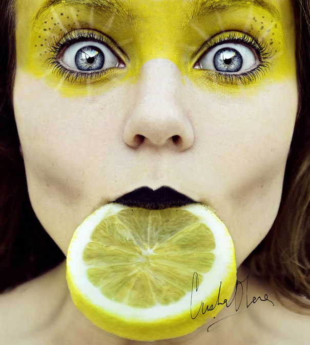
Cristina Otero.
The photographer has changed the connotations of colour that we normally assossiate these colours with, to create them as powerful and vivid, rather than tranquil and serene, or more playful and fun, rather than bold and bright. This is done through the facial expressions of the models, and the way the make-up has been done.
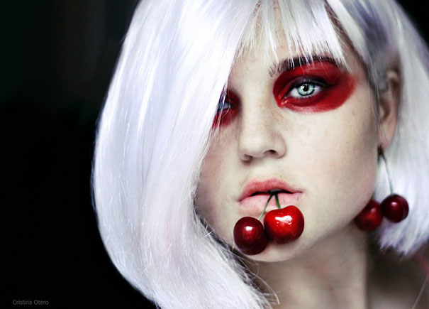

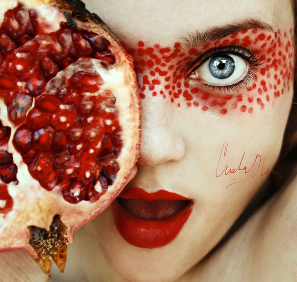
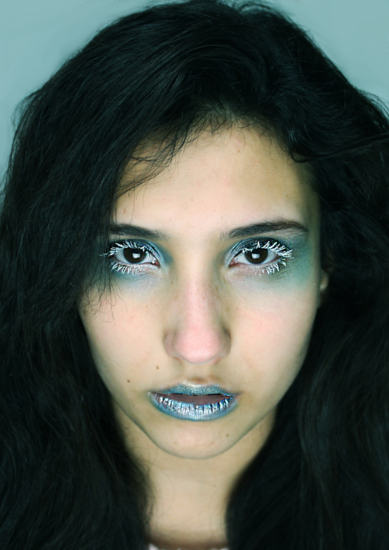
This image is very fixed and planned, the makeup goes well with the idea of the pomegranate, bright red and little circular shapes. Aswell as this, the other part of the pomegrantate - the less noticed part- is very similar to the skintone, it shows a simple colour scheme, paying attention mainly to the boldness of the red. Contributing to the bright vivid colours is the eye. The blue is in contrast to the red, and while blue is very tranquil, in this photo is shows alot of power, and the red lookes more fun due to her facial expressions, as opposed to what we would normaly connotate with the colour red - lust, love / anger.
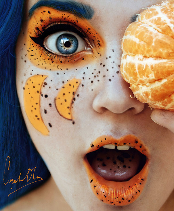
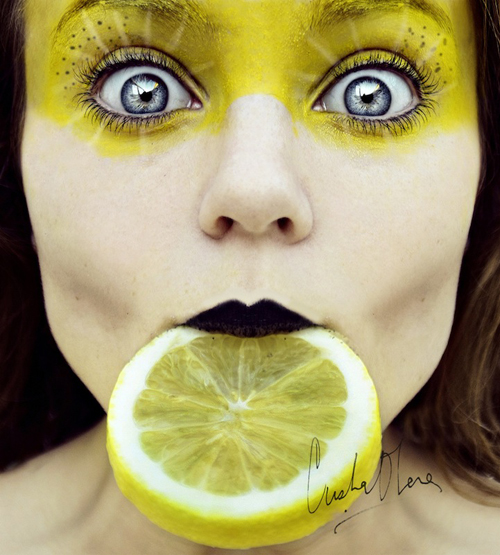
Again the photographer has pre-planned the makeup and how she wanted it to be arranged. The connotations of yellow are normally joyous, and energetic, but this photo shows more wisdom and mystery. This image looks as though the person isn't real, and it looks fake and photo-shopped in to it, or as if its painted, but it still looks really well done. The different shades of yellow are from a pale yellow to a more green-yellow hue which doesn't show much contrast for the eye as it does in the previous image. However the dark lines create the shapes in the face, and the makeup looks very well photo shopped.
Jorge Miguel.
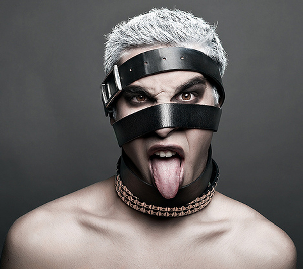
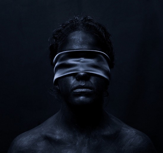
Jorge Miguel has a very unique style of work, obviously shown through his photos. Some seem to represent pain, while others mysterious or maybe even comical. A lot of his work consists on mainly monochrome tones in his photos, sometimes with a small quantity of a different colour, to influence the purpose of the image; such as blood.
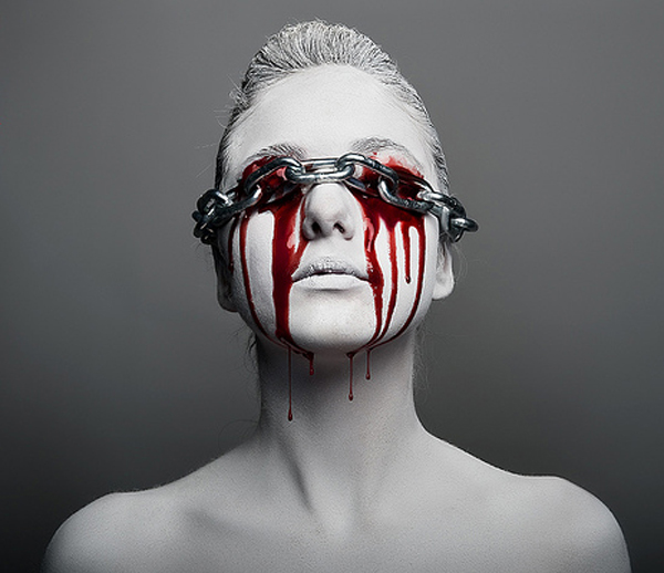
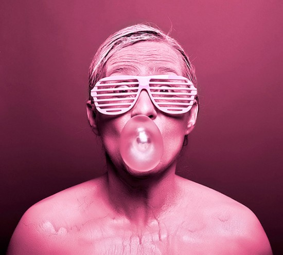
I like how Miguel has displayed this image through pink hues instead of normal black and white imagery. Its also interesting as to why the model is posing in this way and given these props, its hard to figure out what the message of this image is, or if the message is just randomness. I think I could use something like this to inspire me later on in my work, as this image looks fun and unexpected, which I would like to explore.
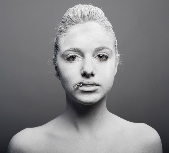
I like the simplicity of this portrait, but its also really unusual and unexpected like Miguel's work is, however I think that the simplicity is what makes this such a powerful image. The attention goes to the mouth, is the model keeping a secret? The blank stare of the model also implies that there is some sort of secret, but we have yet to find out and that is why I find this image so intriguing.
My Jorge Miguel.
|
|
These are my representation of Jorge Miguel style photos. I used split lighting and a flash to create the images. As Jorge Miguel uses a variety of objects through his work, i decided to take this from my own perspective, covering the face with a mixture of powder and cream to create the weird ambiance that I interpret through Miguel's photography. Afterwards I chose the best five and then edited the hues and saturations so that they are mainly monochrome images, while sill showing the split lighting technique that i used. |

Red can normally be seen as the color of fire and blood, so it is associated with energy, war, danger, strength, power, determination, perhaps evil as well as passion, desire, and love.

Green is the color of nature. It symbolizes growth, harmony, freshness, and fertility. Green has strong emotional correspondence with safety. Dark green is also commonly associated with an envious nature.

Orange is associated with joy, sunshine, and the tropics. Orange represents happiness, creativity, vibrancy and stimulation.
|

Blue is considered beneficial to the mind and body. It slows human metabolism and produces a calming effect. Blue is strongly associated with tranquility and calmness. It can also be associated with a sadness, or the cold.
Purple combines the stability of blue and the energy of red. Purple is associated with royalty. It symbolizes power, nobility, luxury, and ambition. It conveys wealth and extravagance. Purple is associated with wisdom, dignity, independence, creativity, mystery, and magic.
Pink is the color of the sweet young girl, full of fun.
|
I thought about what types of lighting I could use for each connotation:
red - blood/evil, split river cop.
green - nature, fully lit.
pink - bubbly-spray lighting, clamshell, butterfly.
blue - cold- clamshell, lit underneath.
orange - vibrance - spray lighting, clamshell.
purple - mystical, rembrant lighting.
red - blood/evil, split river cop.
green - nature, fully lit.
pink - bubbly-spray lighting, clamshell, butterfly.
blue - cold- clamshell, lit underneath.
orange - vibrance - spray lighting, clamshell.
purple - mystical, rembrant lighting.
AO2: Creative Making.
Experiment with and select appropriate resources,media, materials,techniques and processes,reviewing and refining ides as work develops.
Lighting Techniques.
Rembrandt lighting is used for a mysterious and dramatic atmosphere to the image, but to also look slightly flattering as well. It is achieved by positioning the light not directly to the side of the model but between the front and side of the model. When a triangle shape has formed on the opposite side of the models face that is when the lighting is positioned successfully.
Clamshell lighting is another technique used to create a glamorous look to the model. It is used by 2 light sources positioned in front of the model: one above and titled down 45 degrees, and one below the model, tilted up 45 degrees. From this the face is lit perfectly with hardly any shadows to the face, but it is not too over-exposed. 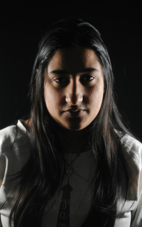
This lighting style is also used to create a mysterious or sinister atmosphere in the image. It is the same lighting positioning as split, so the light is to the side of the model. But the positioning of the camera is slightly to the side of the model, outlining the side of the face.
|
Butterfly lighting is used to create a flattering effect to the subject. To achieve this style of lighting, a shadow under the nose needs to be created, considered to be a butterfly shape.
It is done by using only one soft light source, positioned in front of the model, facing down from above them at a 45 degree angle, the light cant be too hard as it may over expose some areas, the whole face needs to be light and visible. 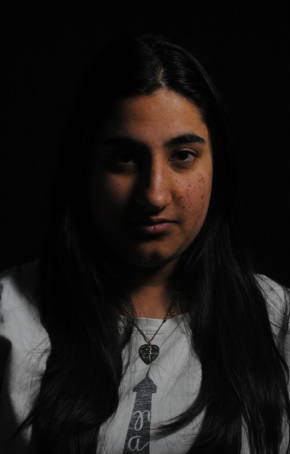
Split lighting is used for a sinister or evil atmosphere for the photo. By positioning the light directly to the side of the model it obviously only lights up that side of the face of which its pointing at, leaving the other side pretty much pitch black.
This technique is used to create a suspicious look to the model. By positioning two lights either side of the model it produces a streak of shadow through the middle of the face. The further behind the model the lights move, the bigger the shadow streak, but the more in front of the model the lights are positioned, the thinner the streak.
|
Practise shoots.
Blue - Tranquility.
This is a first attempt of the connotation of blue to represent peace and tranquility. These were not successful as it is hard to look peaceful without looking sad, therefore showing blue to represent sadness. I don't find these pictures strong in any way, and so i will be trying a different connotation of blue, for it to connote a cold nature. I will also be needing to incorporate lighting styles within the shoots as with these i was just practising with the makeup and positions of the model.
Blue - Icy/Cold.
I felt that these images are better suited to a connotation of blue, as by using makeup it is easily able to achieve an icy look to the model, and with facial expressions it makes it more interesting than to have a sad looking model, which looks bland and boring.
Red - Anger.
Like the blue, these images were not satisfactory enough to represent evil as the connotation of red. I think if i incorporated lighting within this practice shoot it may have been more successful but some images look worried rather than evil, and i don't think enough of the evil persona was carried through the model. I think trying different positions can help me, maybe face down images, baring teeth, crazy looking/murdering eyes.
I took some practise shots before shooting the proper images, practising with lighting techniques to create the sense of evil, as well as the model practising facial expressions.
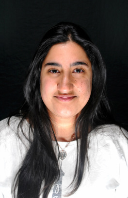
Purple - Mystery.
|
|
|
These images were alot more successful when representing the colour purple. They show a mystery, but still need more photoshop work done to them. The positions where the head is looking over the shoulder are the strongest, and i think i will be moving forward with the connotation of mystery for my final piece. I think some adjustments can be made to the look of the model, lipstick, hair, costume?
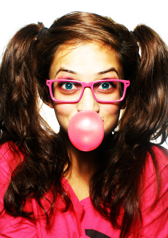
Pink - Bubbly/fun.
|
I used Clamshell Lighting to create these images above based on an image of Christina Otero's work. The model experimented with different faces and emotions that link with a fun girly girl nature. I think this shoot was one of the most successful so far, as it is easy to play around with, something that looks so simple can be easily shown in different styles and emotions. However I think I can improve on the model, and for my final piece i think i could use a different hairstyle that connotes a more fun-loving nature, which will be a lot stronger. |
|
Green - Nature.
|
My idea for green to connote nature in this way was inspired by this image, by Jorge Miguel. Obviously by putting leaves in the hair it is loosely similar to the photographers work. |

|
AO3: Reflective Recording.
Record in visual and/or other forms ideas, observations, and insights relevant to intentions demonstrating an ability to reflect on work and progress.
PINK- BUBBLY, FUN.
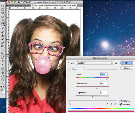
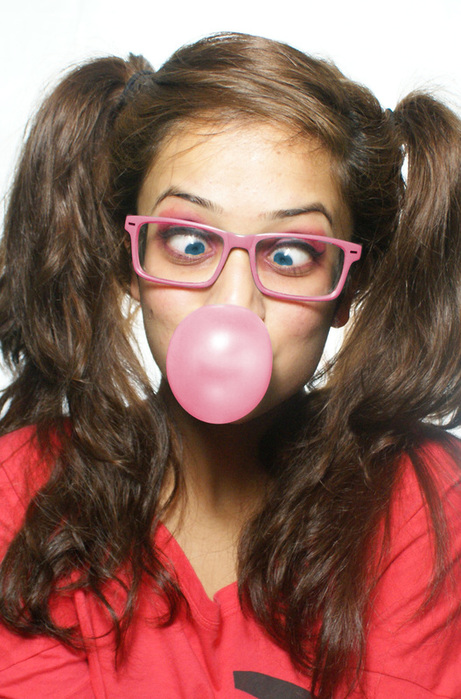
I initially chose this image to use as a final piece as the fun loving nature would consist of something silly, for example the cross eyes in the image, but after photo shopping it and looking at other photos, I will not be using this image as i don't think the positioning and facial expression of the model is strong enough. Perhaps if her eyes were a lot more cross-eyed and in the middle it would pursue the purpose of a fun loving and bubbly nature, |
|
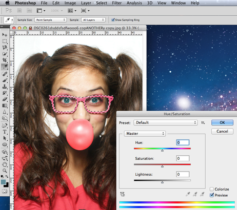
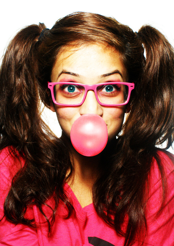
I think this image is a lot stronger to pursue for a final piece as though the eyes are not cross-eyed, they are very strong as they stare straight ahead, also the expression on her faces conveys a bubbly and full of life character, which is what I was hoping to capture. So like the previous image I changed the colour of the eyes and the colour of the bubble and glasses on Photoshop but now I think the image needs to look cartoon-like, to make the image look a bit more exciting and creative, but not so that it looks tacky. |
|
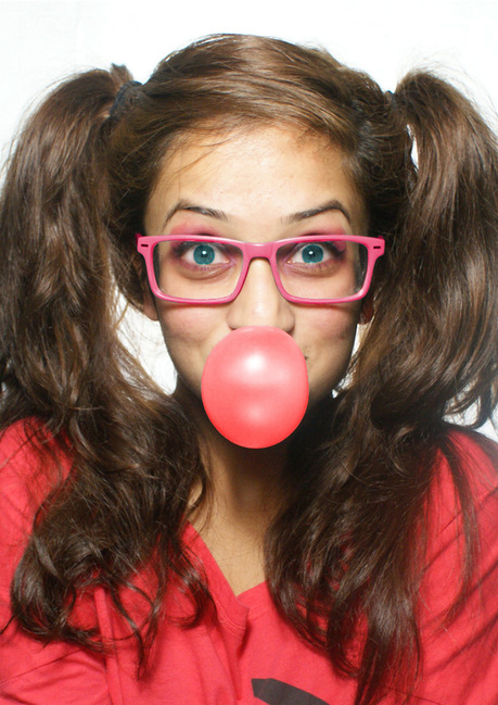
To create my cartoon-like effect I used the colour burn on Photoshop and then adjusted the brightness and contrast, though I think this image is too dark and therefore does not reflect the light and fun aspect I was going for, so I would have to make the image brighter.
|
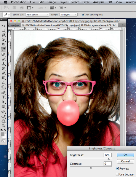
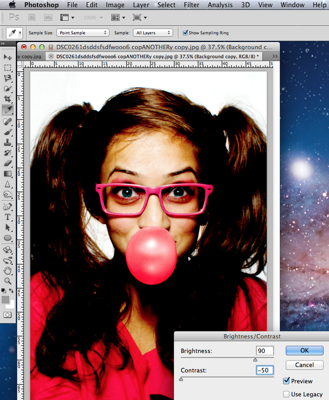
I lowered the contrast and raised the brightness slightly more, this is not what I am looking for as the image is too bland and boring now. I think something between these two images will look satisfactory.
|
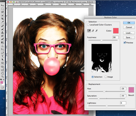
I felt the top in the image was not pink enough, and looked slightly reddish. So using the colour replace on Photoshop I was able to slightly enhance the red to a more pinkish colour. |
|
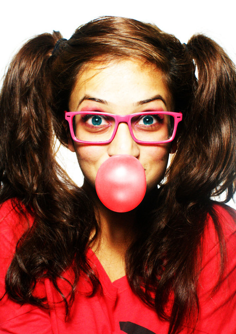
FINAL IMAGE.
|
I am really happy with this portrait. I think that the pink really stands out, especially against a white background. I had originally wanted it to be pink, but I felt that by having it white it slightly separates the model. This shows her as someone that is different, bubbly and courageous and does not fit into the background |
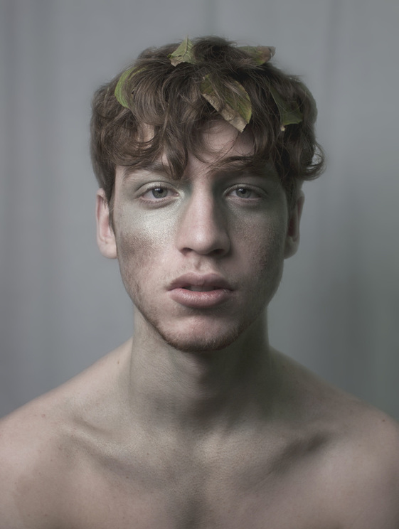
GREEN- NATURE.
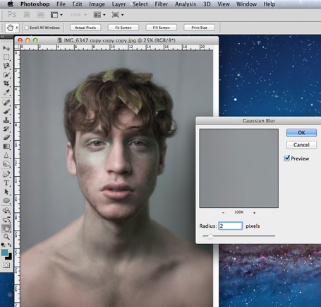
I firstly de-saturated this photo slightly, to create a more calm and relaxed atmosphere, like a lot of nature is. Then I decided to bring the model forward from the background, I achieved this by using the Gaussian blur tool on Photoshop, and I think this worked quite successfully. 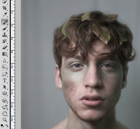
To make the model look more blended and fresh, I airbrushed the impurities on the face with the healing brush tool. |


|
FINAL IMAGE.
|
This was by far the best image from the shoot. The model looks very relaxed, as if one with nature. Aligning with this relaxed tone of the model, I thought by de-saturating it to an extent that you can still see the green in the image helps to show a calm mood through the entire image. However i didn't want the whole image to look extremely tired out, so I blurred the background to make the model stand through more. I think the facial hair adds to that look of nature, as it is textured, and not smooth. As if he were some sort of tree? The models eyes are a blueish greenish colour, which reminds me of water and the land, which promotes the feel of green and naturism. |
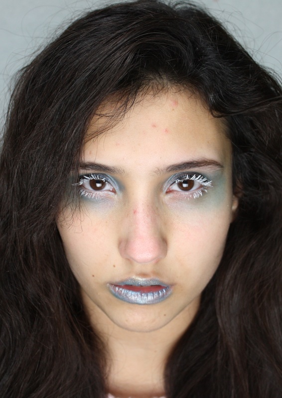
BLUE- ICY, COLD.
|
|
I narrowed it down to these 2 images as being the best from the whole shoot. However the more i look at the second image it conveys a clearer take of an icy look, as the model looks as though they are staring into your soul, and makes you feel cold yourself.
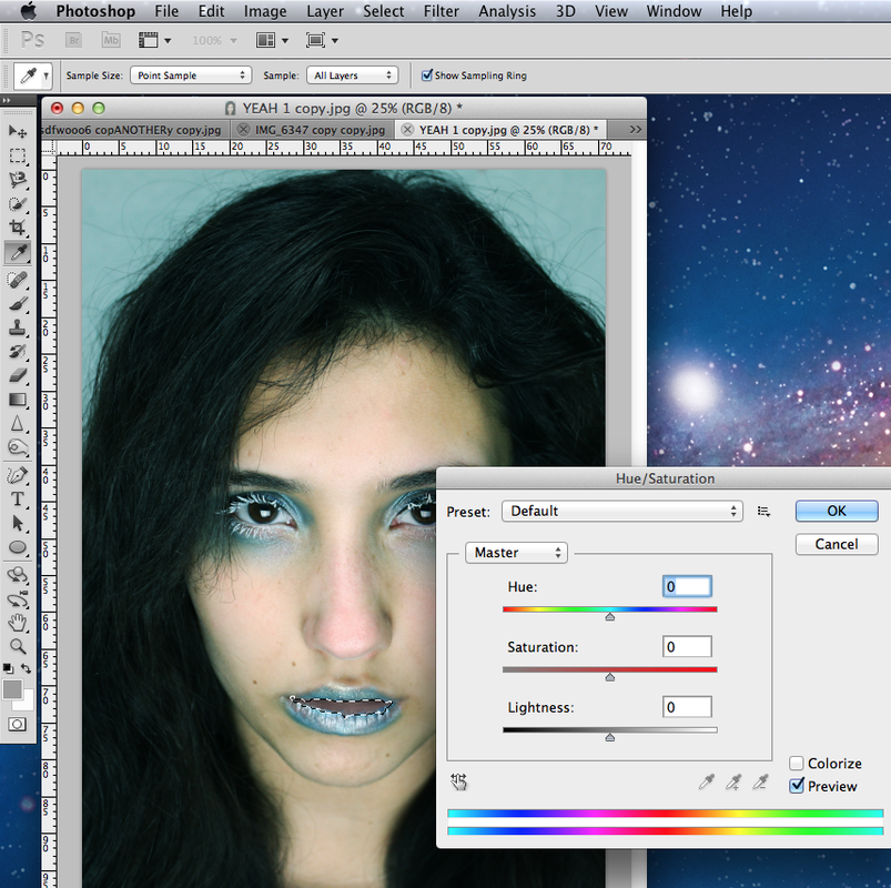
Using photo shop I experimented with the contrast and brightness, and also changed the hue of the whole image, making it slightly more blue. I also decided to experiment with the models hair fading into darkness as well as just a plain blue background. I changed the inside of the lip by selecting it and desaturating it in photoshop, as the pink it was before create more of a warm tone even though it was such a small area of the image. |
|
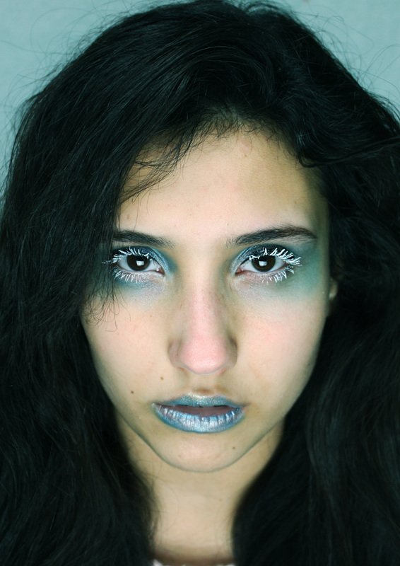
I had an idea to make the background black, and have the hair fade into the darkness, to create a sinister tone to the iciness. But then i felt this looked too much like an image i wanted to pursue later on. For the connotation of red. |
|
FINAL IMAGE.

|
After changing the red lip colour I thought it may look good to contribute to the icy look by having the models hair sort of fade into darkness, but then it looked to sinister and I did not feel it would be satisfactory for my 'icy' look. I like how the makeup is not too much that it looks tacky, but looks quite subtle and in turn is powerful, I think the facial expression is a big contribution to the 'icy' stare in the portrait. I decided the image should be quite close up to emphasize the power that comes through the iciness of the model. |
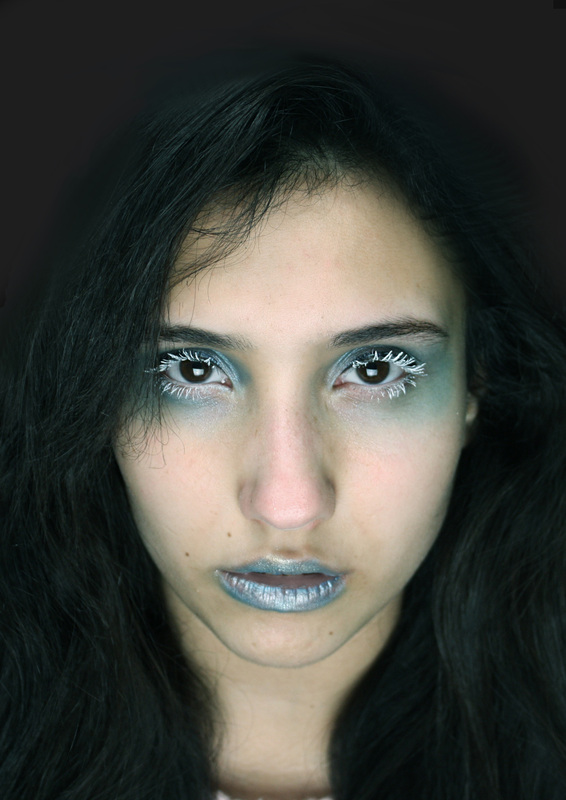
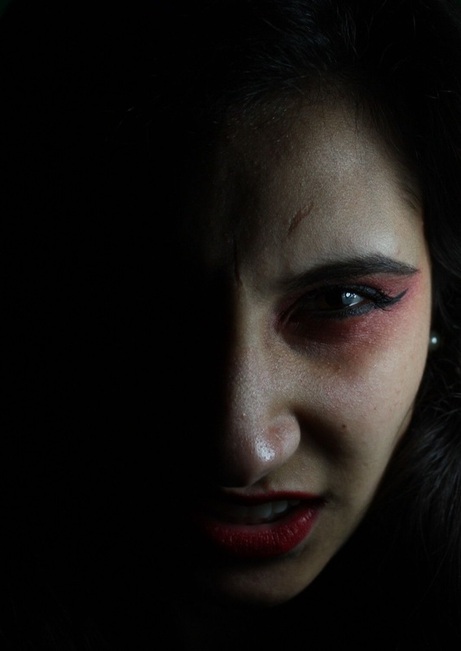
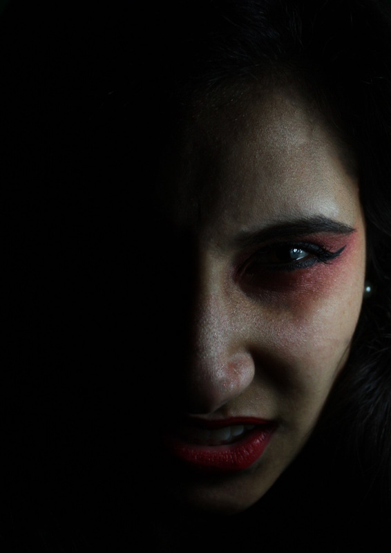
RED-ANGER.
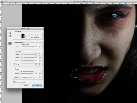
I wanted to raise the brightness and contrast of the image but in doing this it meant the lips went to dark and were not visible. I wanted them to stand out, so on photoshop I refined them and made them stand out. |
|
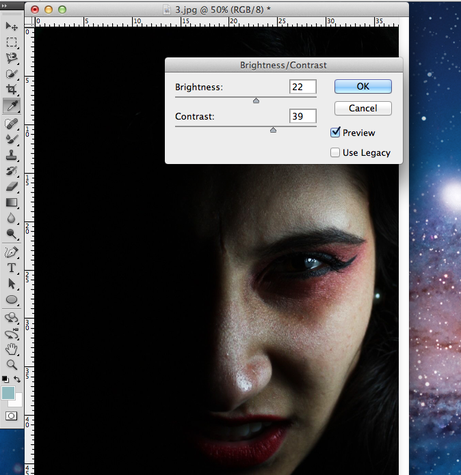
I then went on to change the brightness and contrast of the image, as to make it look more dark and therefore show the anger. I think the darkness of the eyes so that we cant even see them develops a fear for the audience, we do not know what they're going to do. |

|
Final Image.
|
I find this image very satisfactory in showing anger as it conveys the dark elements that contribute to anger. The image is not too exaggerated and airbrushed, so it creates the emotion that the anger is more genuine, rather than forced. |
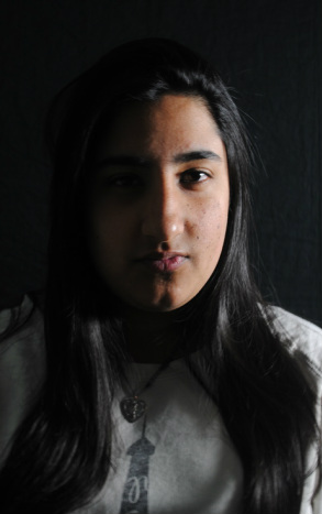
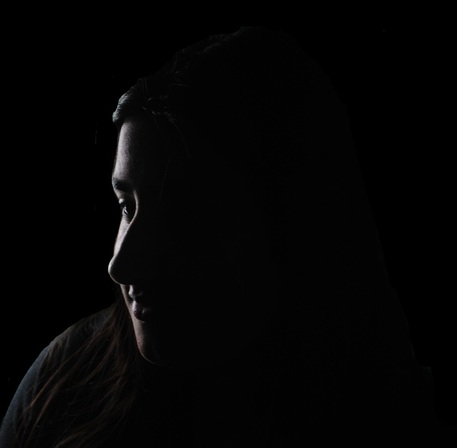
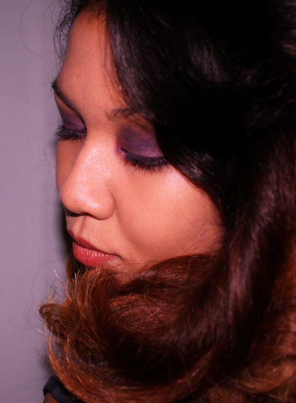
PURPLE-MYSTERY.
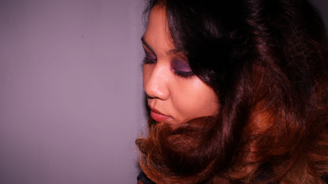
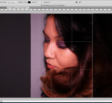
The image was previously landscape, which I felt captured that sense of mystery as there was nothing surrounding the model and therefore we would wonder why. However, all my other final images are portrait orientated and so it would not fit, meaning I cropped it to portrait. |
|
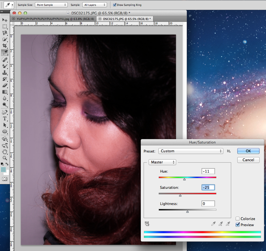
I felt that not too much needed to be changed about the image, so I slightly changed the hue and saturation so that there would be a small atmosphere of purple, and also that it would not be too vivid and look more playful and cartoon-like, rather than mysterious. |

|
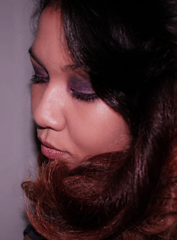
FINAL IMAGE.
|
I feel that this image was very successful as it conveys an intimate, mysterious emotion that I was looking for. I think the simplicity of the portrait and that it is linked to mystery, strips back any give-away of any secrets that the model may be hiding, which proves to be a satisfactory portrait. |
AO4: Personal Presentation.
Present a personal, informed and meaningful response demonstrating critical understanding, realising intentions and, where appropriate, making connections between visual, written, oral or other elements
FINAL PIECE.