LIGHTING.
Luca Pierro
I find Luca Pierro's work highly creative and therefore interesting, for my topic I am looking at his work in terms of what light brings to the photo, what different ways light can be shown and what it can show and not shown.
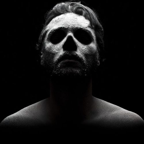
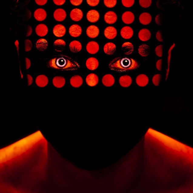

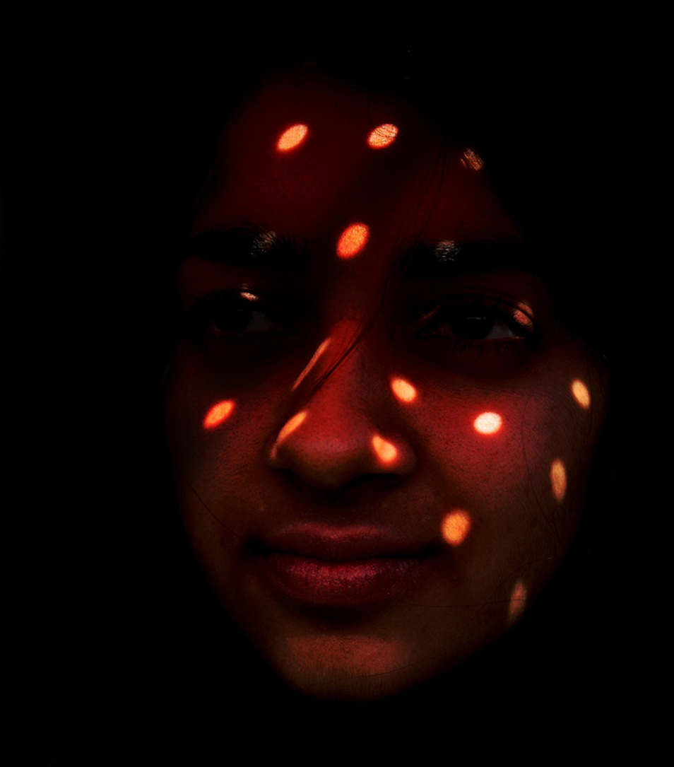
BROKEN LIGHTING.
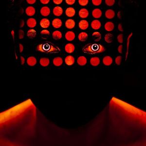
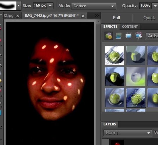
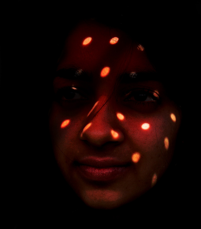
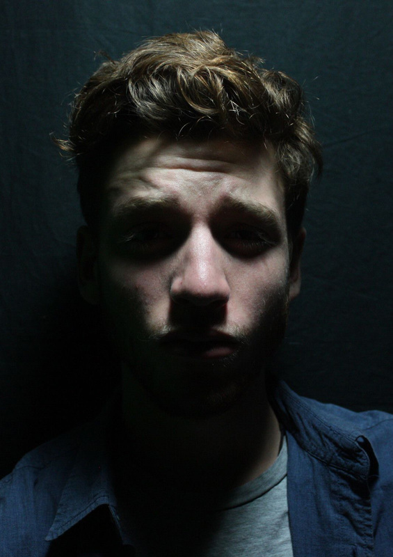
I feel that this image is very interesting as the face is blacked out apart from the red dots, however the shoulders are not blacked out, and makes me wonder if it had anything to do with lighting or just on photoshop. I think that broken lighting provides an interesting feel to a simple image and can sometimes highlight certain areas, for example in this image; the eyes.
UNDERSTANDING.
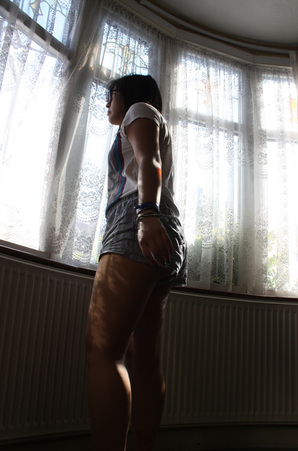
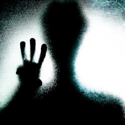
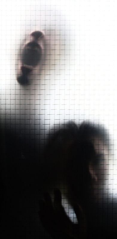
To demonstrate my understanding I have taken this image to show what broken lighting entails;
strong enough lighting, i.e the sunlight
an opaque material with areas of transparency e.g a netted curtain placed between the subject and the sunlight.
This produces this pattern of light on the subject.
To demonstrate my understanding I have taken this image to show what broken lighting entails;
strong enough lighting, i.e the sunlight
an opaque material with areas of transparency e.g a netted curtain placed between the subject and the sunlight.
This produces this pattern of light on the subject.
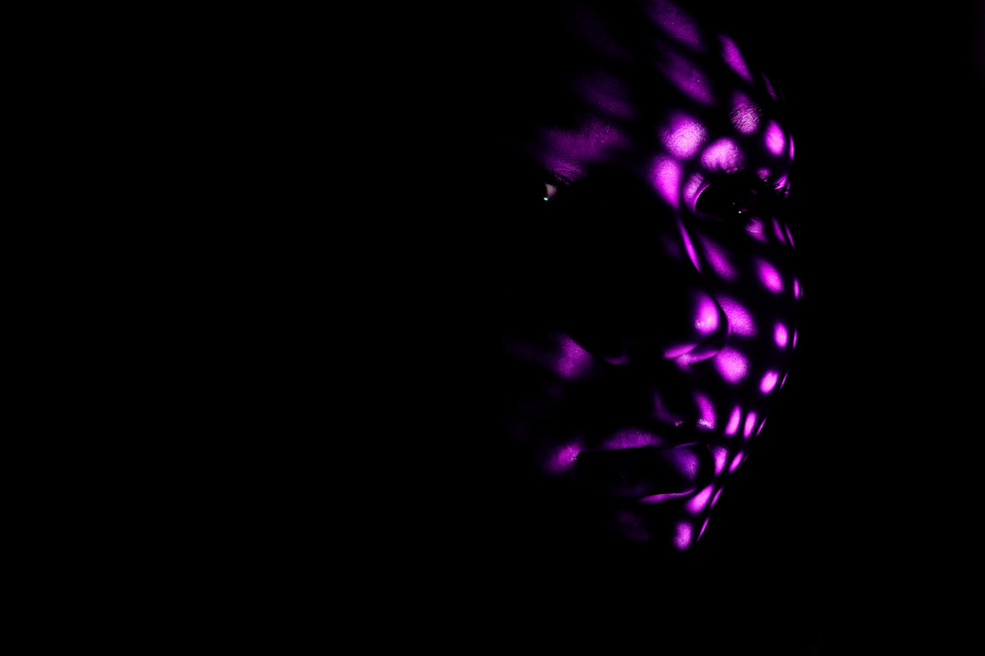
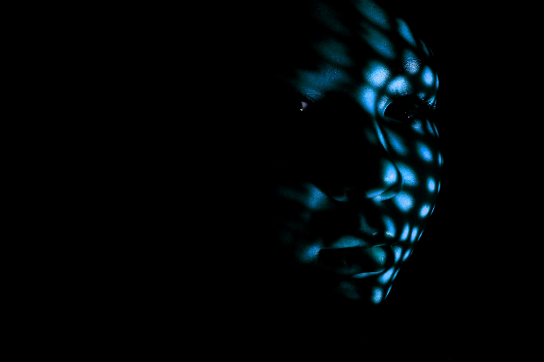
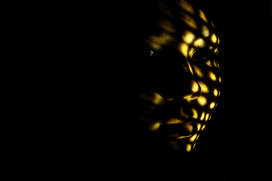
PHOTOSHOOT #1 (Slideshow)
I decided to use a piece of cardboard as it is opaque and made holes in it. And using a red lamp i was able to show the light shining through as a regular lamp was not strong enough to show the desired effect. However i did not get the complete desired effect i wanted as it created dark dots on the models face rather than light dots on the models face.
|
|
|
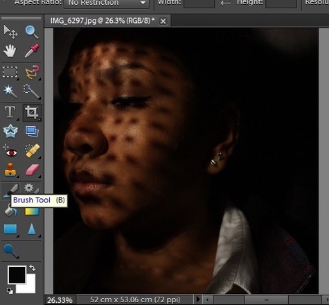
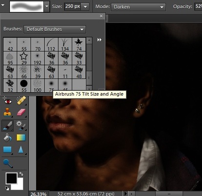
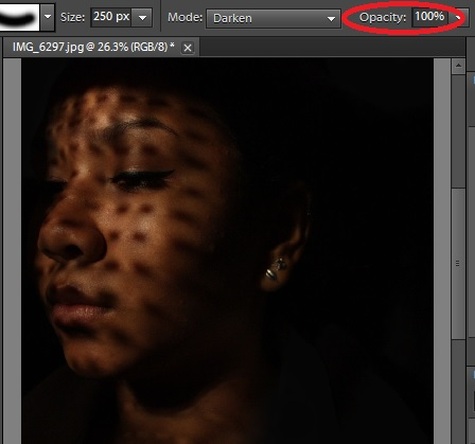
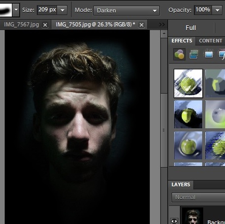
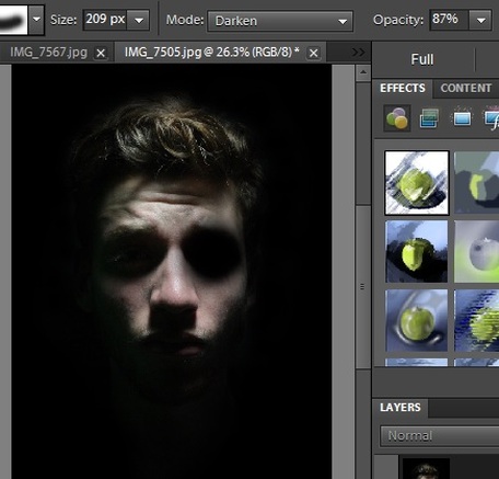
Through Photoshop I used the brush tool to get rid of any unnecessary areas of an image i chose and blacked it out using 100% opacity.
|
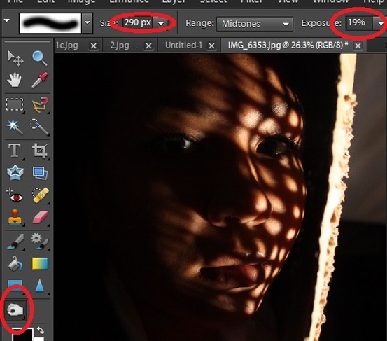
I also used the burn tool to show another way of getting rid of not needed areas and to create more of a contrast between the light and dark areas.
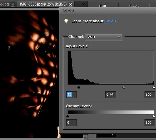
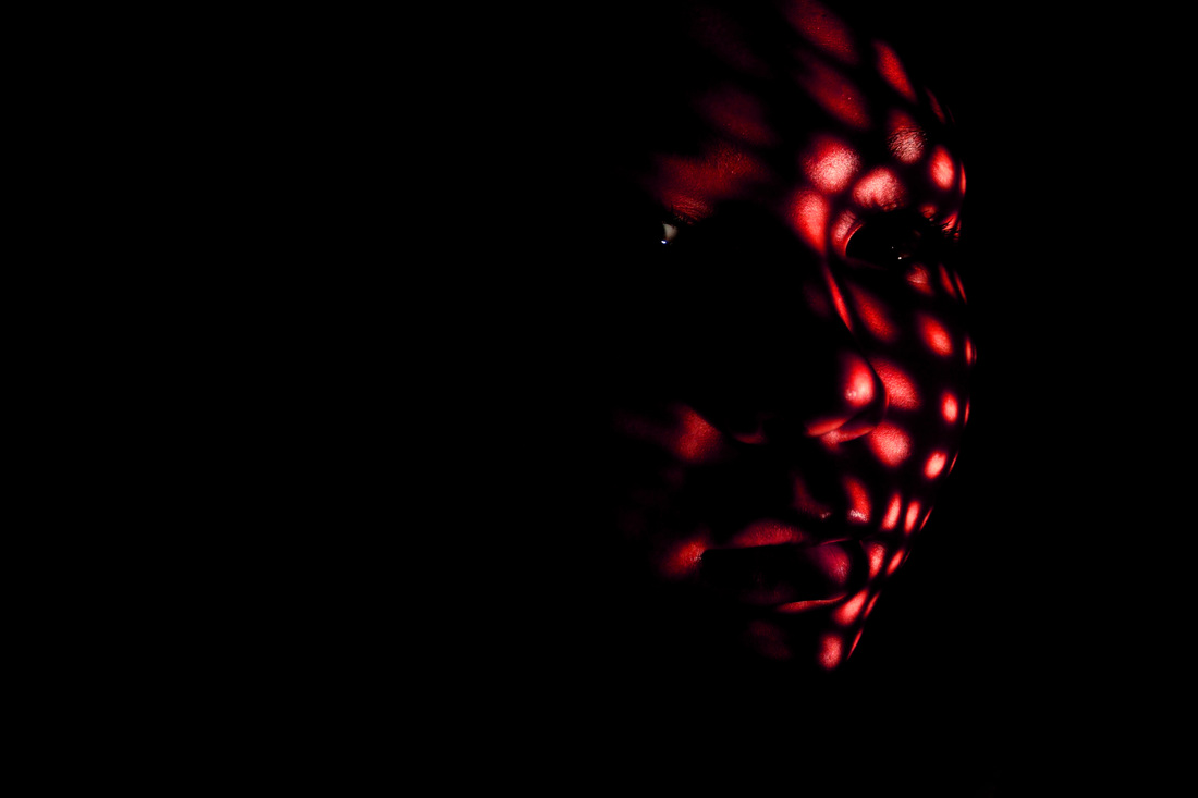
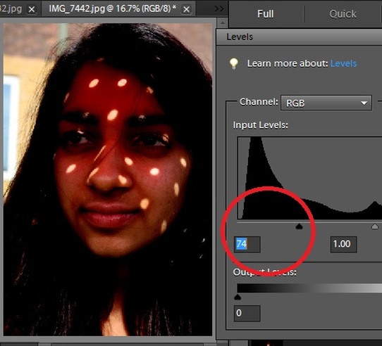
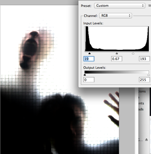
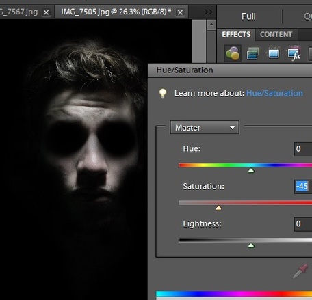
I felt that the images needed something more to it to make it more visually pleasing and interesting, so on Photoshop i increased the levels as to show a contrast that focusses mainly on the lighting rather than the model
|
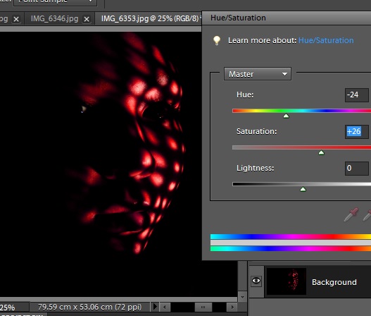
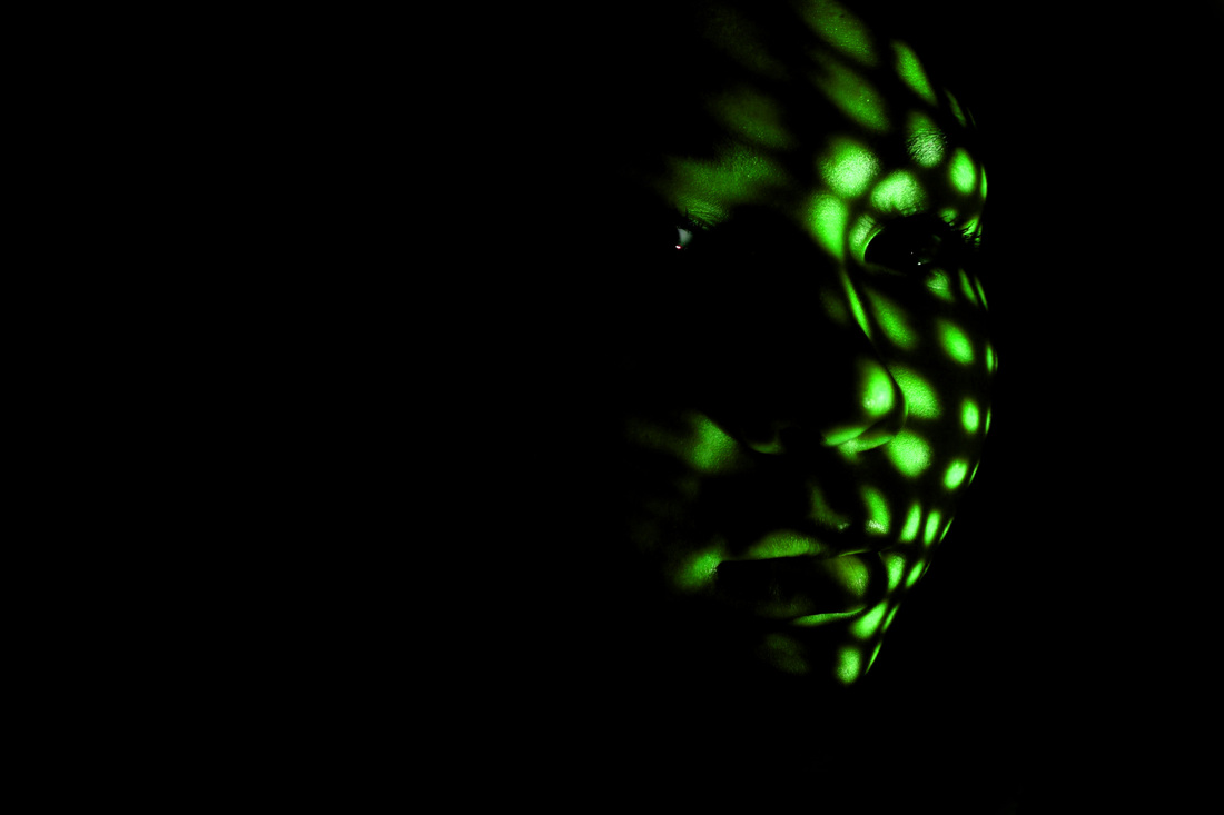
I then decided to change the colours of the chosen image as to show a more lighthearted yet creative portrayal of Luca Pierros work. I then carried on to do this same process for different colours.
|
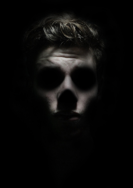
MINI FINAL PIECE (Click To Enlarge).


PHOTOSHOOT #2 (Slideshow)
Using a piece of red painted plastic with holes in it and using natural sunlight i was able to make what i feel is a better shoot for broken lighting than the previous.
PHOTOSHOOT #3 (Slideshow)
I then felt that possibly i needed the holes in the material to be closer together and therefore be more visually pleasing for an audience and also shows a variety within broken lighting. So using a piece of metal with small and close holes in it and again natural sunlight was used.
First i changed the levels of the image chosen on Photoshop to create more of a contrasted effect; by darkening the darkest areas even more.
|
I then used the burn tool to black out the surrounding areas of the face to fill in the background.
|
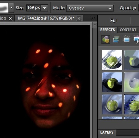
Then using the overlay brush tool i wanted the dotted lights to be shown as brighter.
|
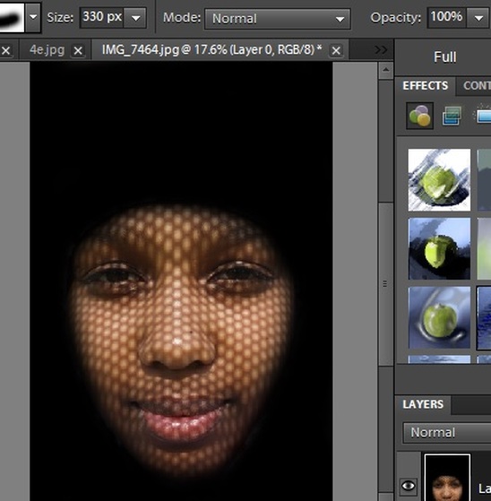
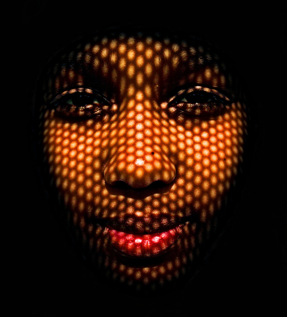
I then wanted to try a different technique with my other photoshoot and so i blacked out all of the image except for the head shape.
|
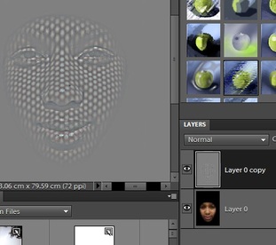
I copied the layer and added the high pass effect to the layer copy.
|
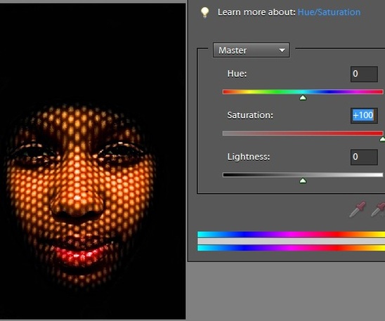
I then overlayed the layer to the high pass copy and increased the saturation too 100 and i felt that it looked quite good.
|
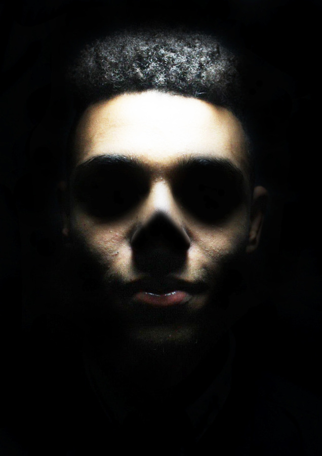
MINI FINAL PIECE (Click to enlarge).
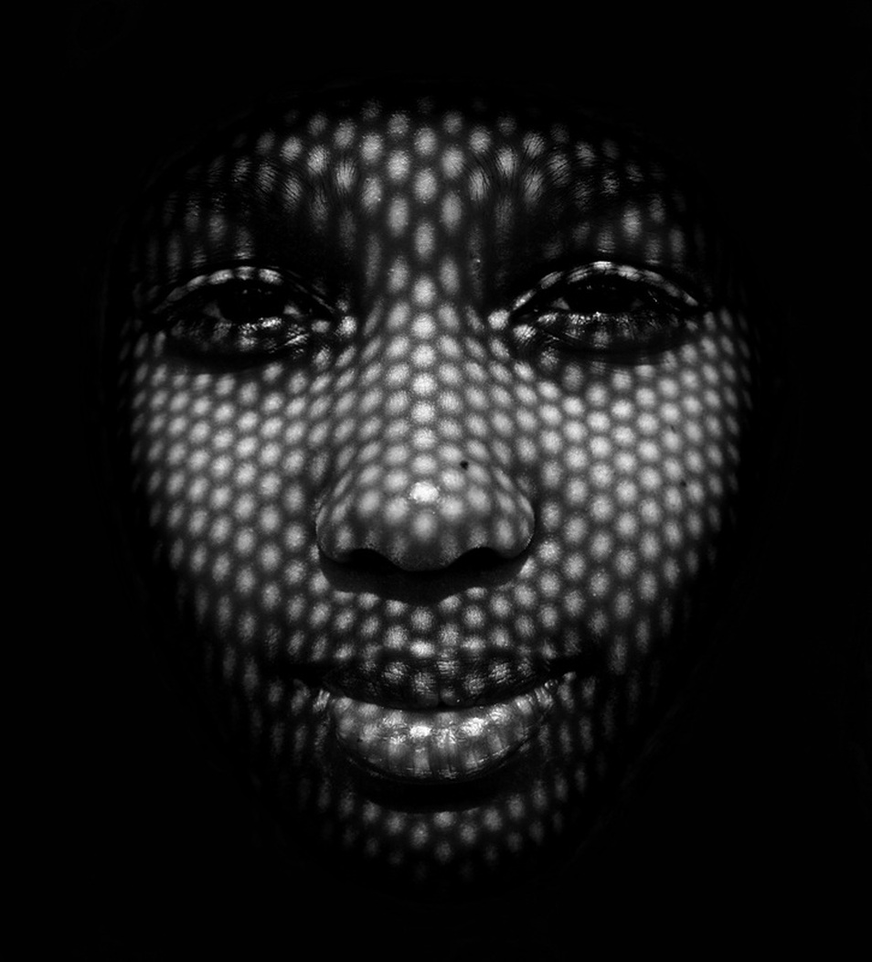
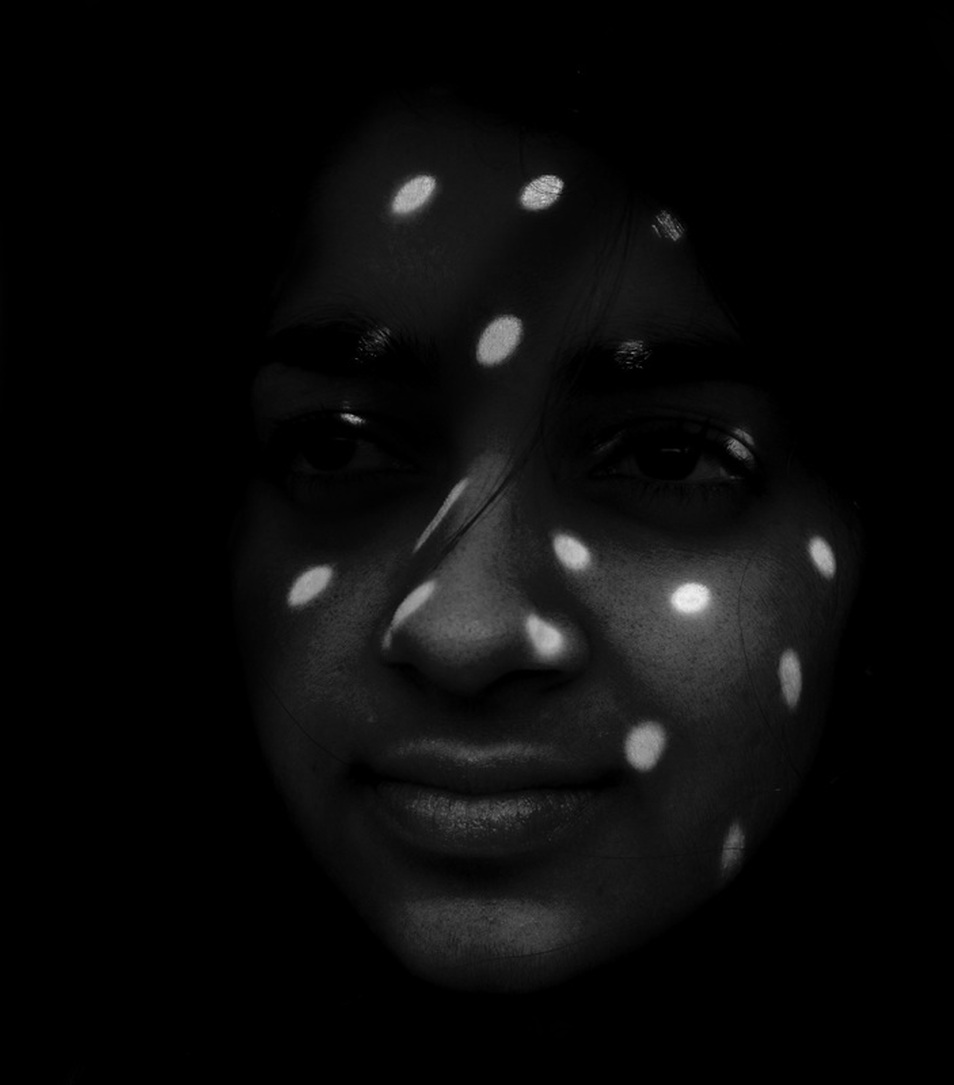
I wanted to see whether the images would look better as a a black and white copy or as I first Photoshopped them. So I put both options in this mini final piece for an audience to create their own interpretations. I feel that the original images I photoshopped are alot better as they show a contrast of colours and I find it fascinating.


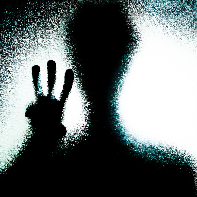
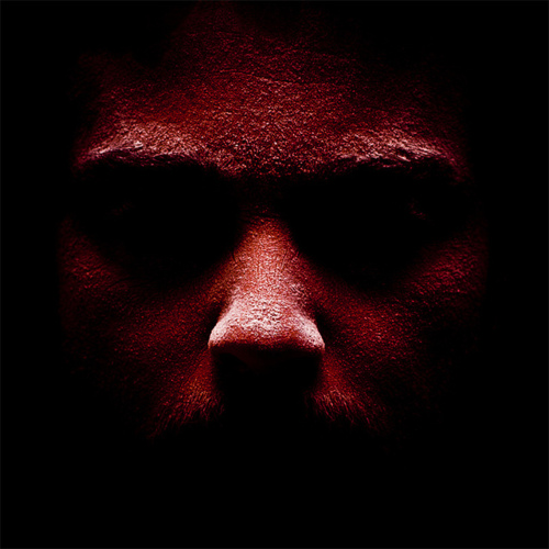
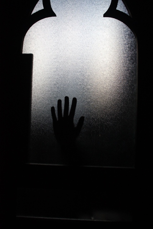
FROSTED GLASS.
I want to experiment with this image style as i have not focussed on any form of distortion that was through the use of materials, as i have rather been using photoshop to achieve this effect in my previous works.
I think by experimenting to achieve something of this calibre shows a different range of this to look at in the image rather than just the light and shadows; the distortion of the subject within itself.
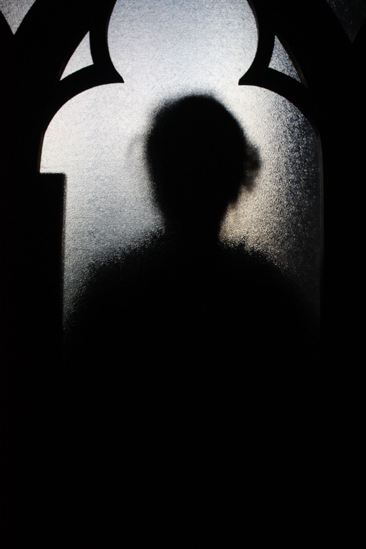
I took a few experimental shots to figure out what i needed to do in my following shoots. And i think with better and brighter lighting the images will be successful.
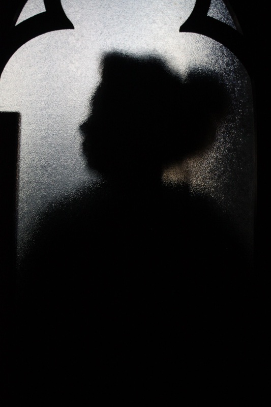
PHOTOSHOOT #1 (Slideshow)
I used a piece of blurred out clear plastic and made use of the natural sunlight for this shoot as before in my broken lighting shoot natural sunlight was more effective than that of a studio lamp. However, in this case i do not think I achieved the best result as i intended to as i wanted to model to end up being completely blacked out and distorted along the edges, to look out of the ordinary.
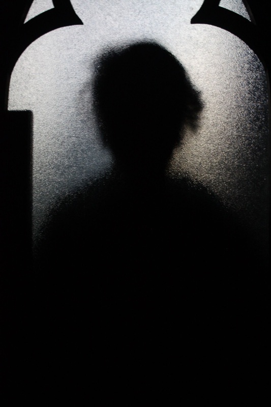
PHOTOSHOOT #2 (Slideshow)
I did a second test shoot to see if by controlling my light source to come from one area i was able to produce a better and darkened outcome of the model through the blurred material
PHOTOSHOOT #3 (Slideshow)
TRANSLUCENT PLASTIC.
First in my process I changed the levels of this image so that the lines around the models were not there anymore thus creating a lighter aspect of the image.
|
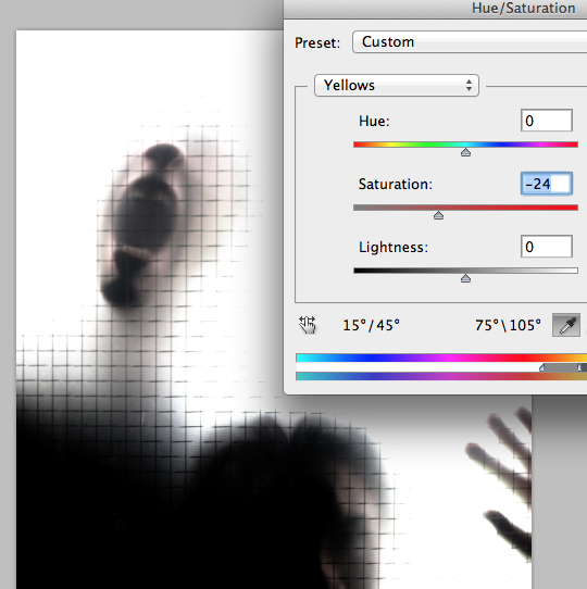
I then lowered the saturation just to make it look a lot more eerie and i think it gives it more of a silent yet scary tone to the image.
|
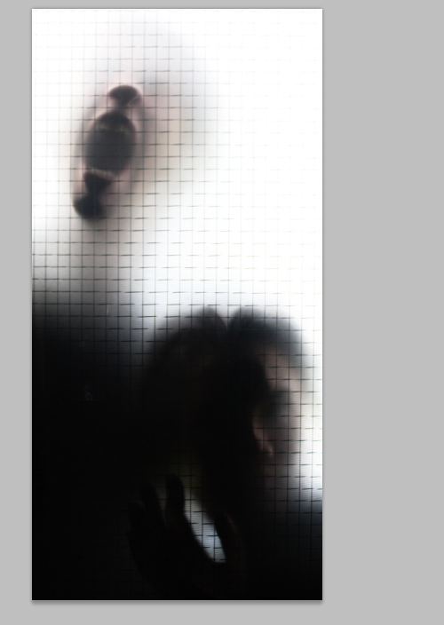
I then cropped the image to make it a lot thinner as it reminded me of something slender, and slender things are normally quite creepy and confusing and mysterious themselves.
|
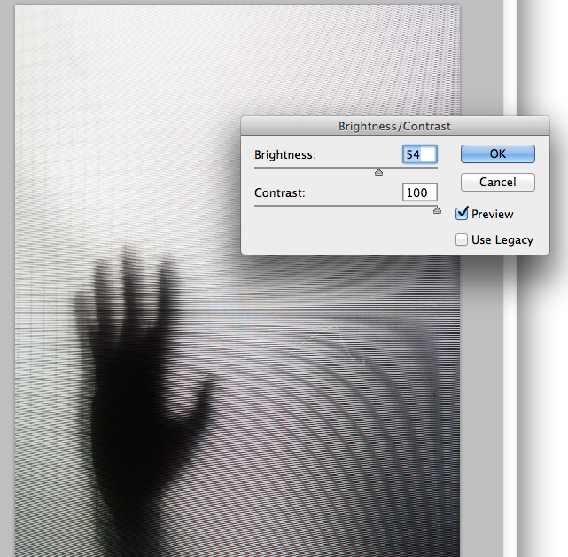
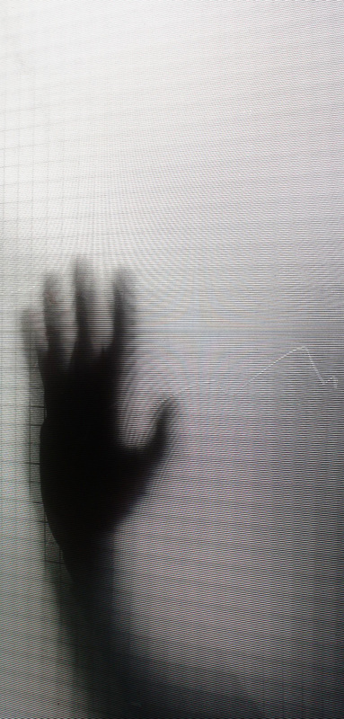
I liked the effect that the translucent plastic gave to the image and therefore i decided to make it more prominent in the image, as the use of lines lead to the hand in the image. Thus i raised the brightness and contrast to what i felt was a satisfactory area to create.
|
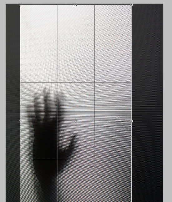
Then to comply with the previous image I cropped it into a slender form.
|
MINI FINAL PIECE (Click To Enlarge).
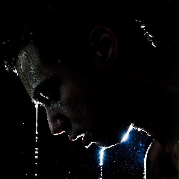
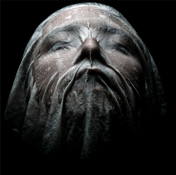
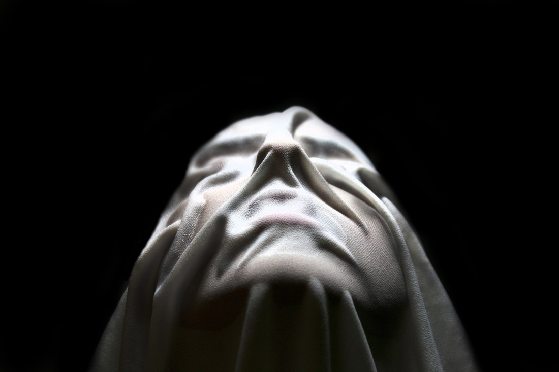
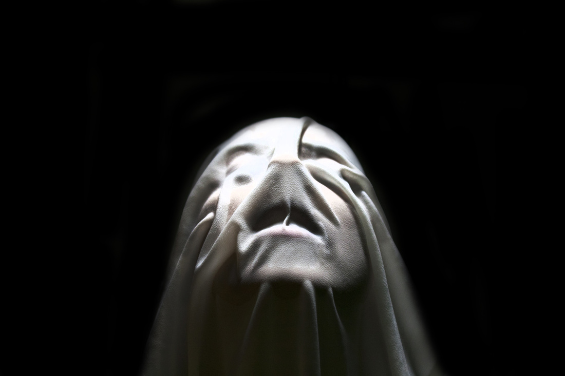
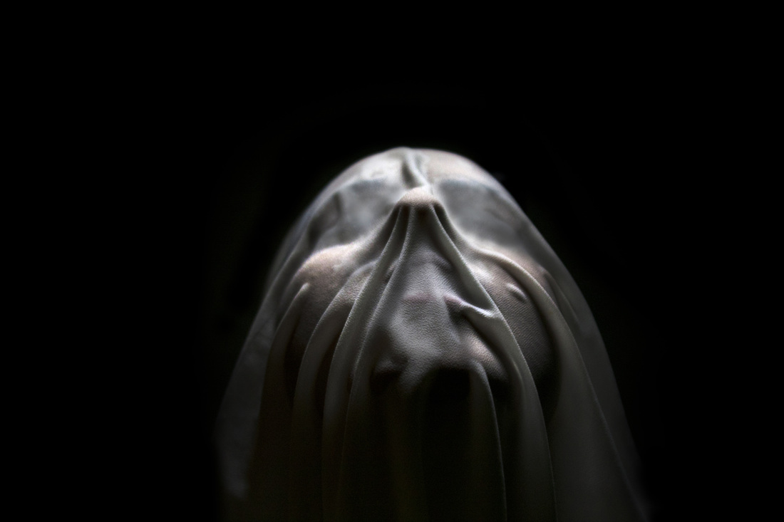
WET CLOTH.

I find this image rather creative and fantastically exhibited. The material used must have been of a very thin consistency in order to show through very accurately the models face.
I like how the creases create the shadows and thus show a mystery and concentration of the image, and the saturation and design on the material makes this image look really beautiful.
PHOTOSHOOT #1 PRACTISE (Slideshow)
To start I did a test shoot at home to see if i will be able to complete the criteria needed for this shoot. I realised i needed a very thin material that of which water can make almost transparent and so i practised with a material i already had that i thought may work. I realised that it did work quite well and with the proper lighting would come out a lot better.
I wondered wether the same material in a different colour would work just as well as the white cloth. I decided to choose a dark cloth to contrast a difference with a light cloth, and my result was not what i had hoped for. the material worked even better than the white cloth in sticking to the face and creating shape, however, the light reflecting off of the cloth produced a grain-like effect and overall was not successful; and thus i did not use it for a final piece.
When editing my images i felt like i wanted my images to look more heavenly as well as mysterious. By using the dodge and burn tools i was able to enhance some areas of light a dark to make it glow and show more contrast.
MINI FINAL PIECE (Click To Enlarge).


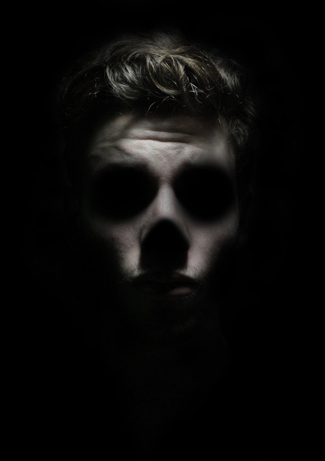
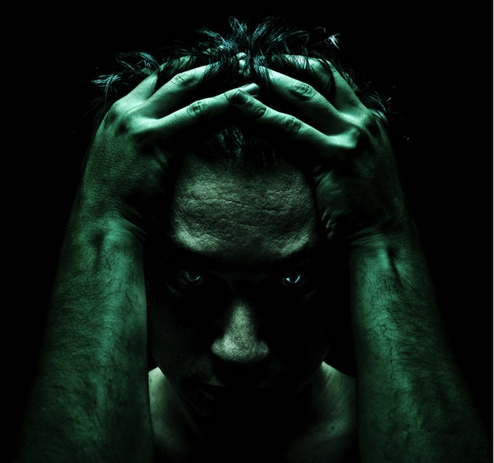
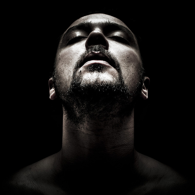
ONE SOURCE LIGHTING.
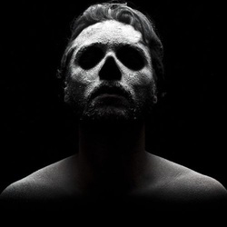
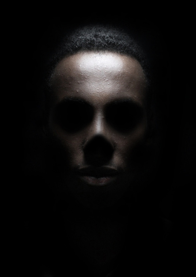
When i look at this image of Pierro's i am intrigued by how the interior has become exterior just through the use of lighting, the amazing thing that lighting can create just from being at the right angle astounds me.
I also enjoy the fact that the image still has the models hair within it, reminding that is is so simply done just from one-light sourcing as without the hair i think the image wouldn't look as captivating, an image could have just been taken of a standard skull. Also the use of the models hair enable to image to look biger, and not so squished in within itself.
PHOTOSHOOT #1 (slideshow)
PHOTOSHOOT #2 (Slideshow)
PHOTOSHOOT #3 (Slideshow)
|
By using one sourced lighting above the models head i was able to create shadows from the brow bones onto the models eyes, without using any photoshop equipment. However for the rest of the image, particularly on the bottom half of the models face, it was tricky to light otherwise the eye area's would not be shadowed. |
On photoshop, i darkened the background of the image so that the model can be focussed on. To do this i used the burn tool.
|
Once the background was darkened, i then carried on to get the best effect possible and darken the eyes and create a darker and stronger line for the cheekbones to achieve a stronger cheek effect.
|
I then lowered the saturation to show a feel that was eerie and conveyed a death element to it as the lighting creates a skull shape to the face. However, i didnt want to make it black and white completely as i wanted to show an aspect of life within the images to represent along with the hair being shown.
|
FINAL PIECE (Click To Enlarge).


By testing this shoot before hand it enabled me to focus a lot more on the other elements i needed for my shoot. I realised that the shadows are at the bottom of the models face; around the neck area, and by using a one light source I put it directly behind to model, facing down, thus allowing the light to shadow around the neck area and shine on the higher half of the face.