dOUBLE EXPOSURES.
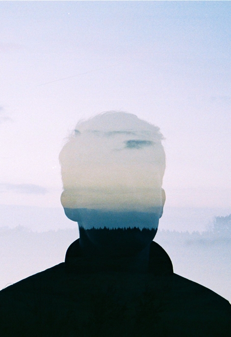
I really like the idea of double exposures as they create different outlooks of life exploring two things that may be linked together, for example an addiction for a person, or a favourite place or food. By combining the two image together we are provided with a refreshing and creative technique.
Experimentation #1 : how to create this effect.
LAYERS:
|
|
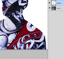
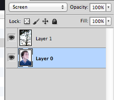
On photo-shop I chose two images and by using the opacity tools I was able to map and layer the two on top of each other to create this style of double exposure.
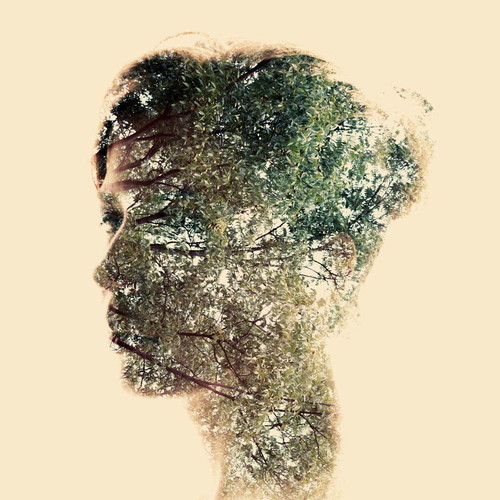
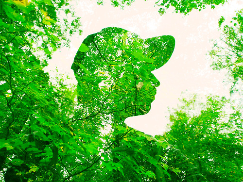
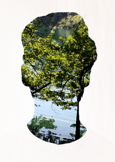
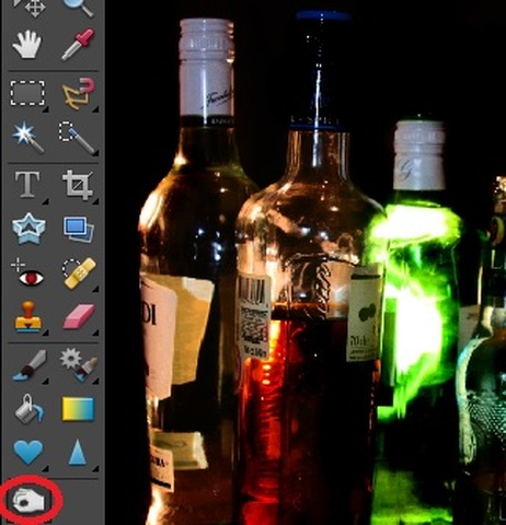
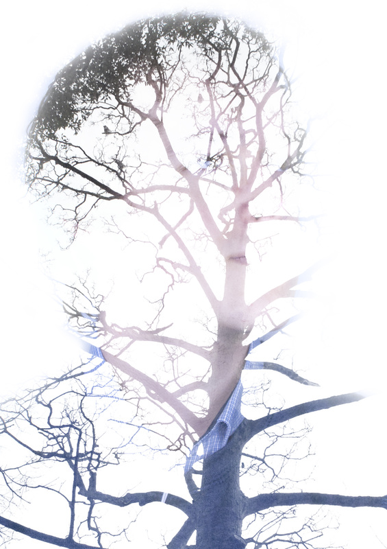
FITTING INSIDE SHAPE:
|
|
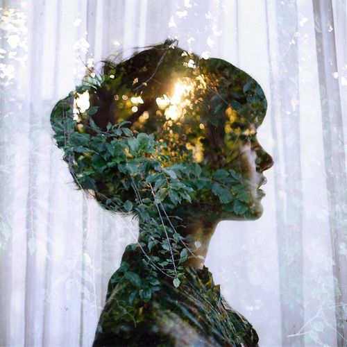
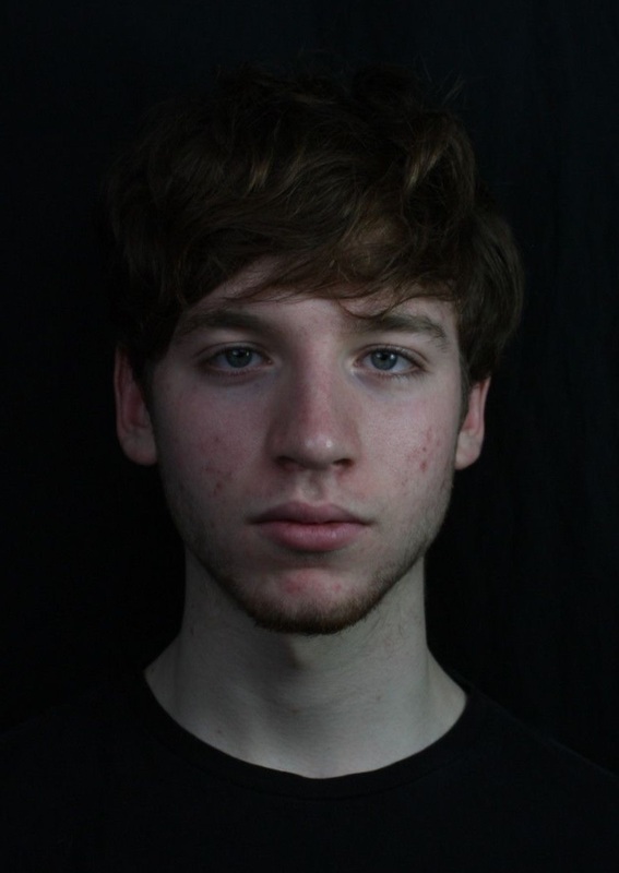
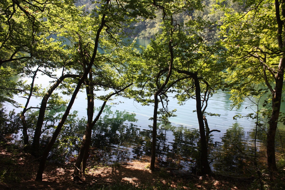
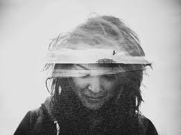
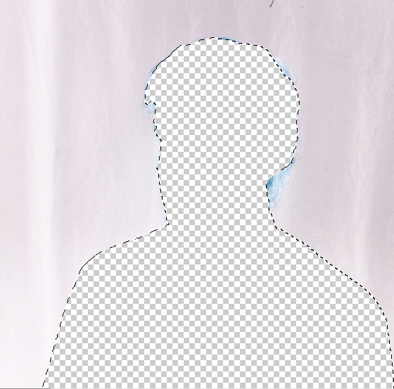
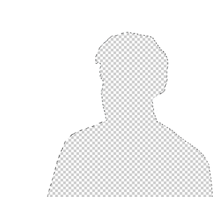
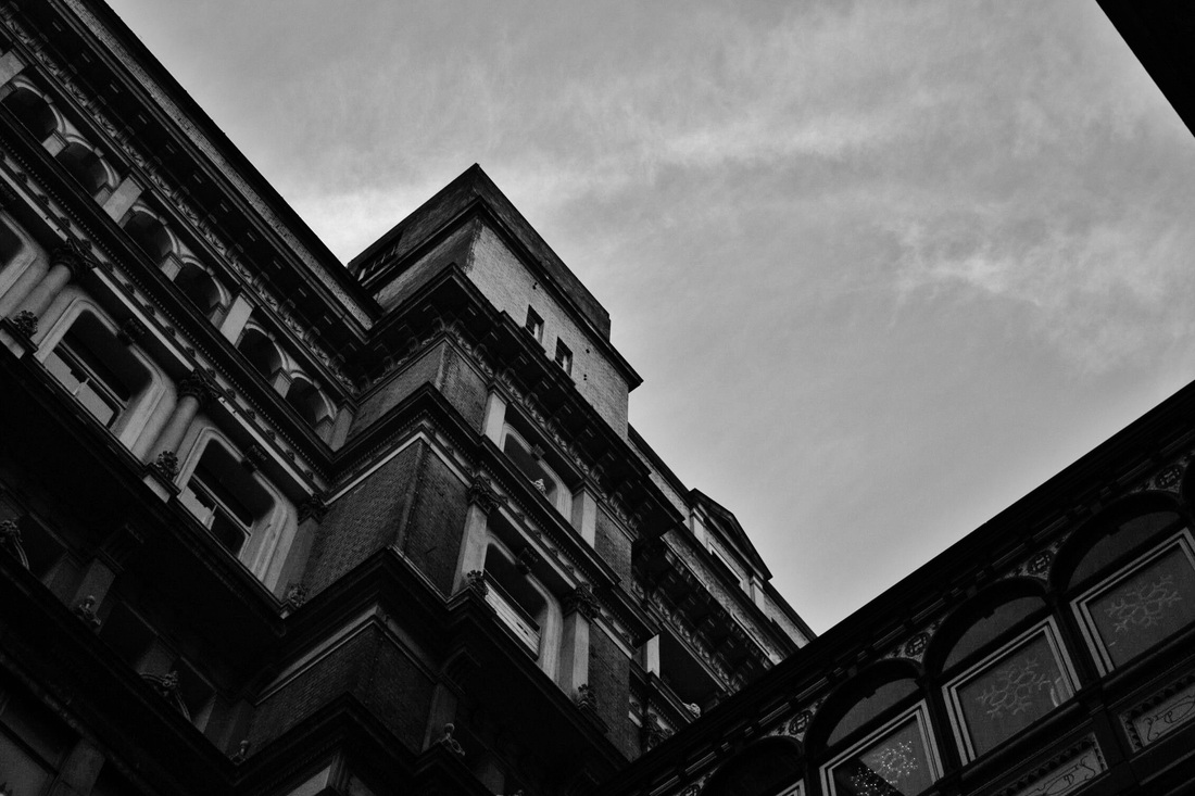
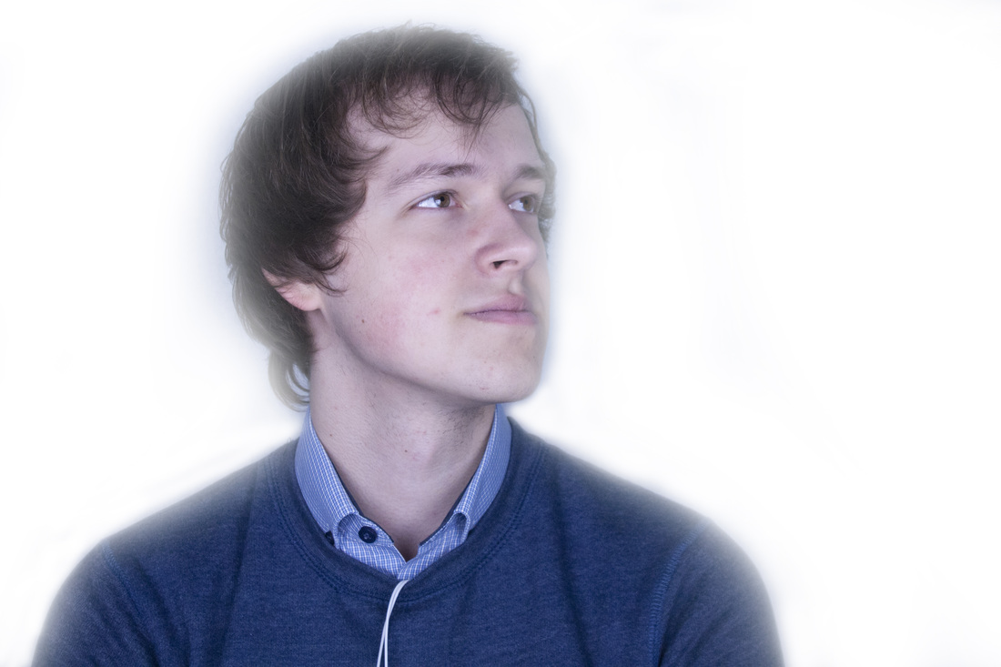
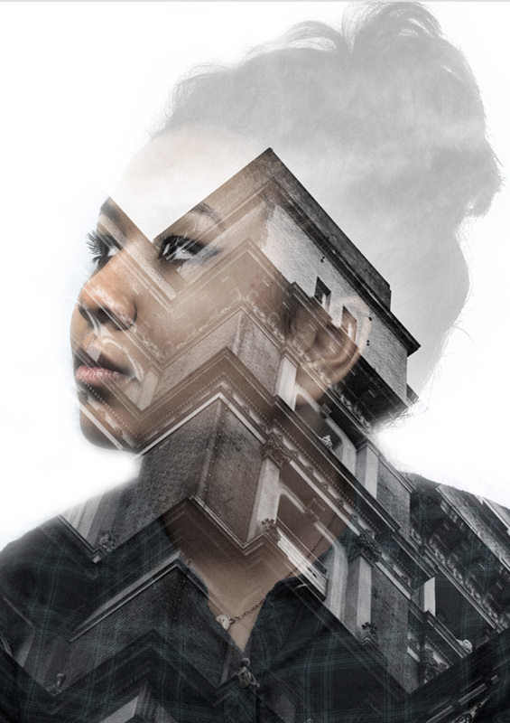
Another way of creating a double exposure, is by taking two images, for example a person and a tree, and by cutting out the face so it just leaves the shape, and mapping on the other image, it creates this effect. I first took the image of the person and turned it negative so that the whole background would be white, I then selected the head and neck and deleted it, which showed through the cut out part.
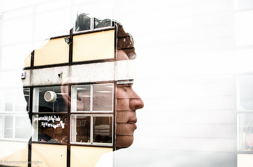
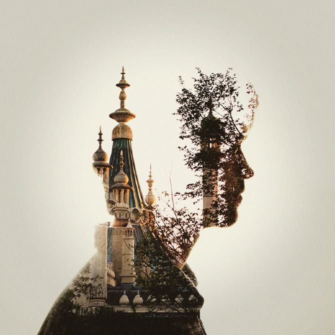
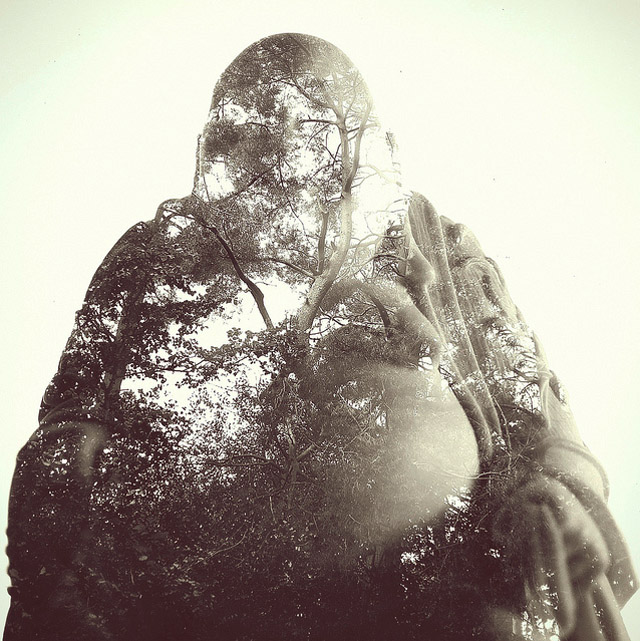
DAN MOUNTFORD.


Experimentation #1
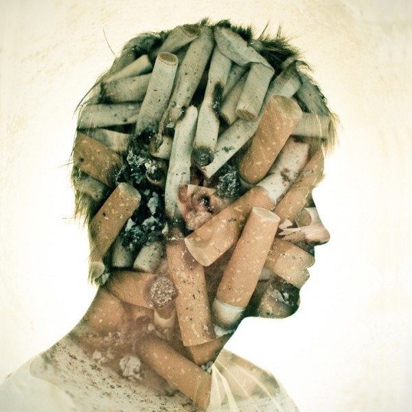
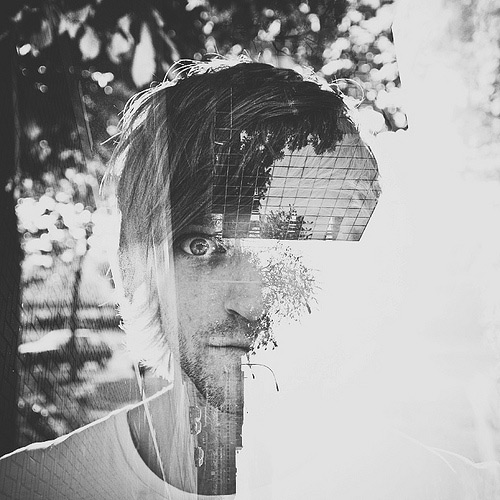
Through my style of this work, i wanted to convey a sense of meaning to the images, so that it symbolically is show by the two merging together. I wanted to focus on personal levels, meaning that the model has some sort of connection with what is put inside of their head.
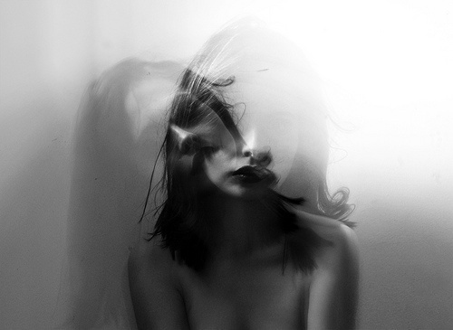
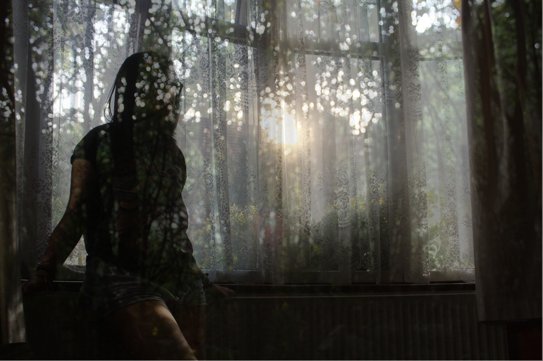
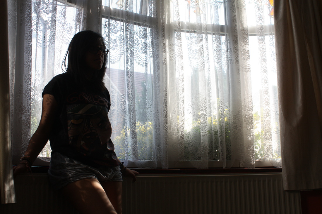
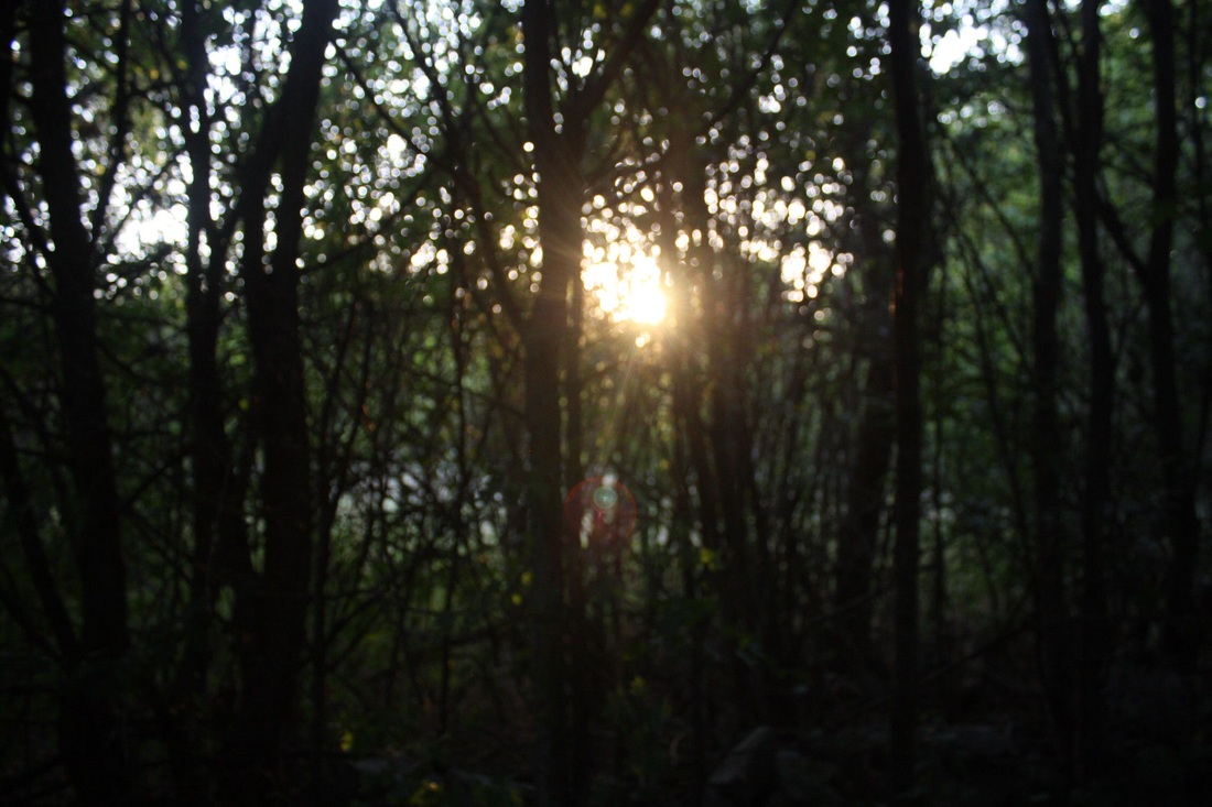
PHOTOSHOOT #1 (Slideshow)
I did not feel that this shoot worked very well, technically and with regards to my idea; the light reflections are not helpful and i ended up thinking that possibly books are not the most appropriate way to continue as i do not think it will create as much of an effect in my work. They are simply too boring.
PHOTOSHOOT #2 (Slideshow)
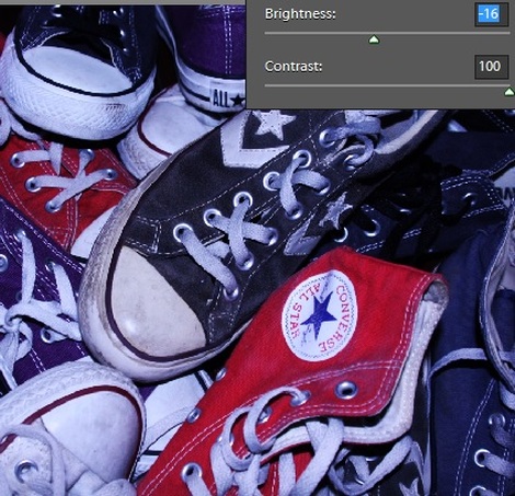
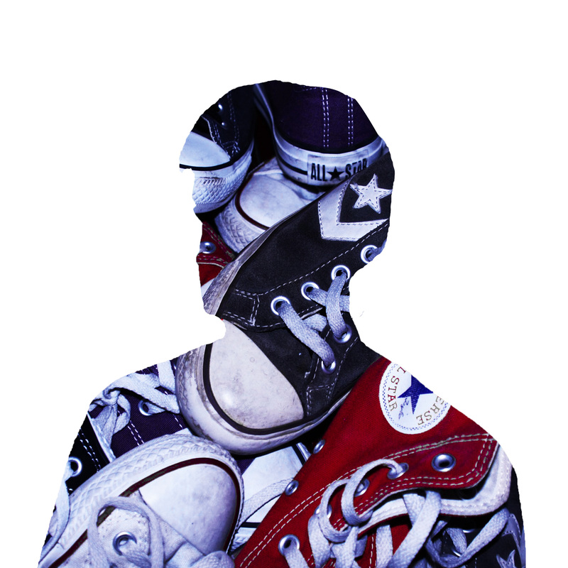
I changed the brightness and contrast to enable a sense of life through the shoes.
|
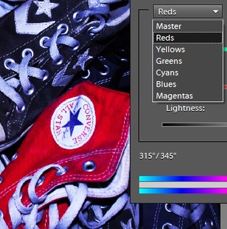
I then used the hue and saturation tools to further the brightness of each colour in the image, to make it look more like a connection and vibrance for the shoes are seen in the final image.
|
PHOTOSHOOT #3 (Slideshow)
PHOTOSHOOT #4 (Slideshow)
I realised these shoots allowed the work to distract due to the writing, therefore an audience would read the words rather than depict what they are to represent. It also looked quite comic-like, i still want to do alcoholism as an addiction, but find another way to do it.
|
|
|
|
|
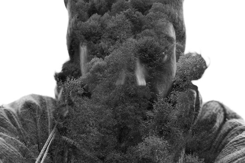
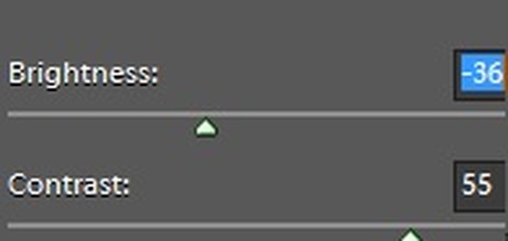
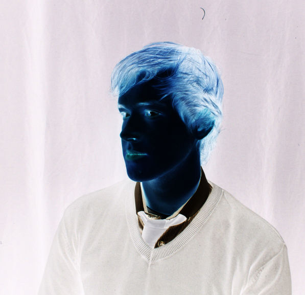
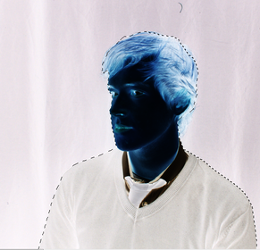
I knew that i needed to make the image in negative tones to help create his effect, but the difference in hue's was not contrasted enough, so i used the brightness and contrast tool and was able to have a clearer distinction in foreground and background.
|
|
|
|
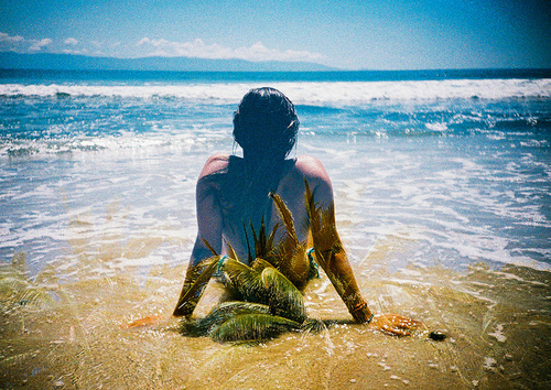
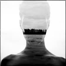
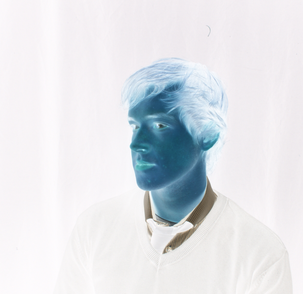
I was able to cut out the model and then replace it with an original image. instead. I also made the background fully white using the paintbrush tool, and used the same process for the other images.
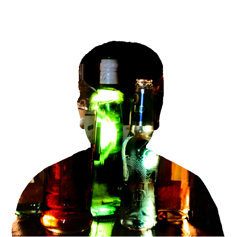
I think that these experiments came out okay for a first try as they do look ;like what i was trying to create, however, i feel that with better objects or even scene in the background and better and more detailed focus on the models as well, then images such as this would be produced even more nicely. I would like to practise more with this idea and see what i am able to create,
Experimentation 2.
PHOTOSHOOT 1
PHOTOSHOOT 2
PHOTOSHOOT 3
|
|
PHOTOSHOOT 4
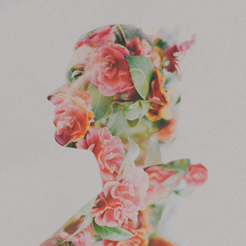
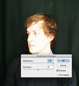
The background was not white enough, and so i burned the background and then used the paintbrush tool to colour in the background fully so that when it came to overlaying images it would not overlay onto the background as well.
|
|
I really like how I have created these images, the image on the left looking a lot like how the artists work is shown. While the one on the right looks a bit more intriguing due to the shape of the tree showing the model through. I really enjoyed exploring and experimenting with this technique but I think less photo-shop heavy work, or perhaps in a different form for a different technque is better suited to my style of photography.
