Exam Brief Chosen: 'Create A Sense Of Atmosphere'.
BRAINSTORM.
SURREALISM.
I have chosen to focus on surrealism as it has the capabilities to branch off into many different areas of the topic, therefore if I decide that something may not possibly be going as planned, I can start a different subtopic of this idea. Also I have never really focussed on surrealism, not even minorly and therefore I think this will be a good opportunity to explore more of my creativity and show wider achievements in my photographic work.
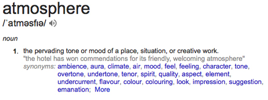
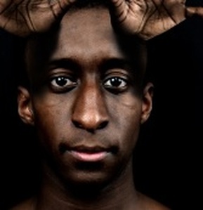
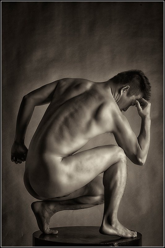
Babak Hosseiny.


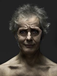

I think this photographers work is really interesting as it looks very simple, but its obvious it has taken alot of work and thought into achieving this result. I chose to focus on this style of work because it is very different from much of the work I have done before - this unit relies heavily on photoshop whilst in the past I have not done as much exploration through photoshop.
EXPERIMENTATION : BABAK HOSSEINY.
I did not want to create pieces that are just the same thing as the photographers work, so by using specific individual pieces, they have each inspired new ideas.
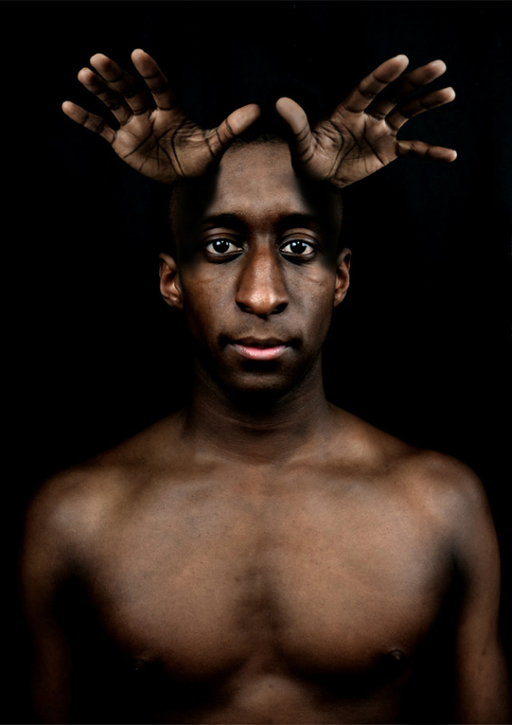
Experiment 1.
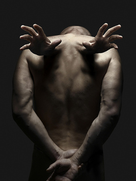
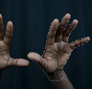
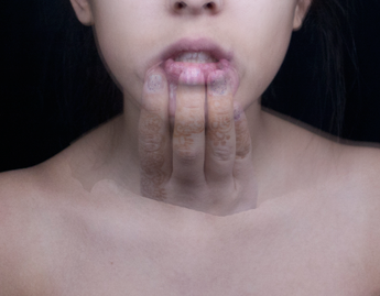
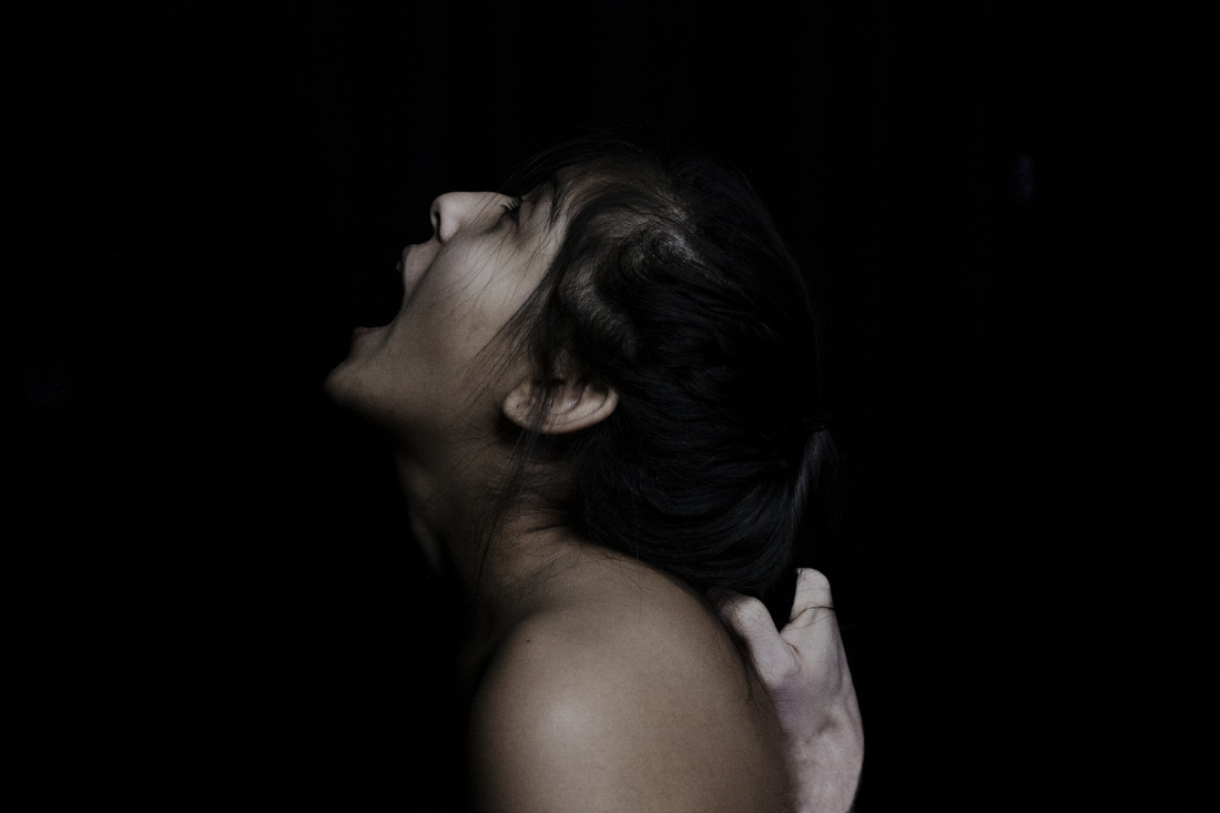
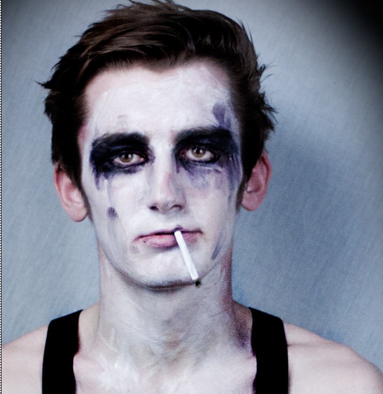
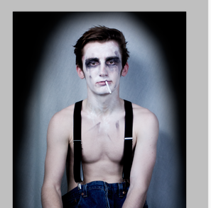
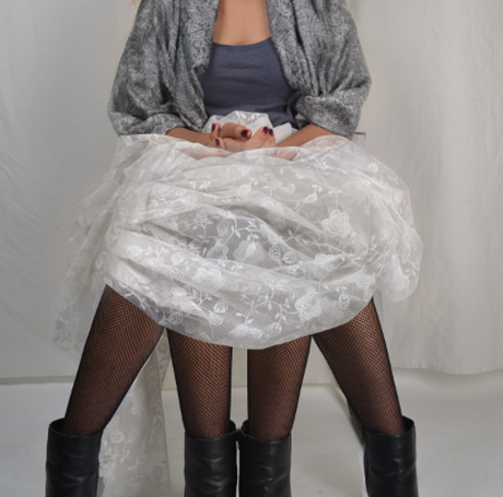
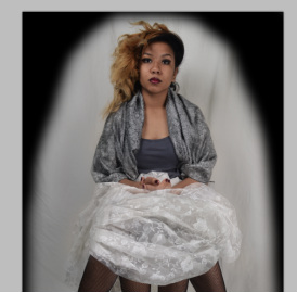
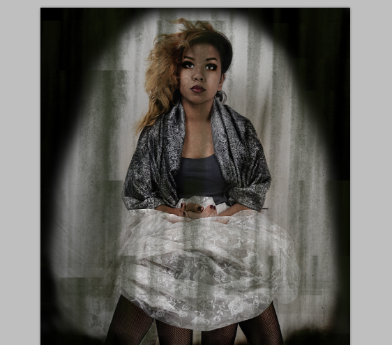
This image is different to the others from the collection of the photographers because it does not show the face - the hands have no link with the face at all. I want to take this idea and use the hands to come out from a part of the model. As the face is not linked with this image, perhaps that should be my starting point.
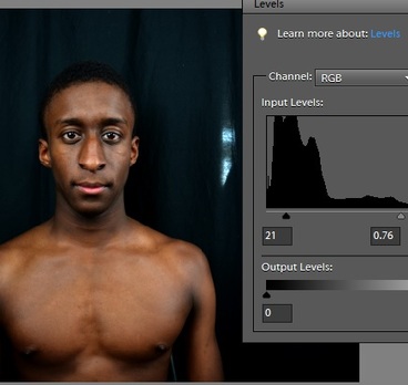
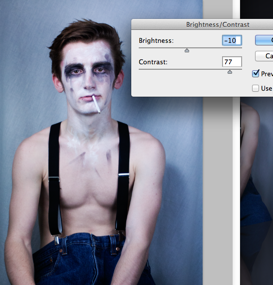
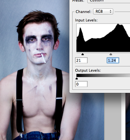
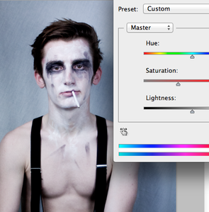
I thought that if I changed the levels of the imge before I started to photoshop, that it could be easier to edit different layers onto each other.
|
I selected hands from a different picture and copied them onto the image of the model.
|
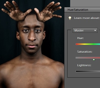
I then made sure that the hands matched the same colour as the model.
|
|
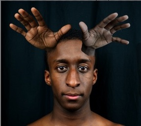
By using the healing patch tool I was able to blend the hands into the head.
|
I then used the burn tool to darken parts of the face and created shadows from the hands onto the image so it looks less flat in the face.
|
|
This image, I did not like the outcome of, because it turned out to look a bit tacky and humorous which is not the effect I was aiming for. In future I will make simpler situations for the images that'll look interesting; rather than silly. |
Experiment 2.
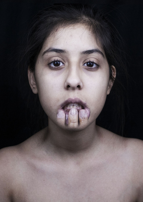
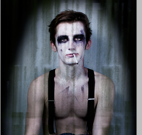
I came up with the idea of rather than the fingers coming out of the mouth, the fingers are pulling away at the mouth.
I thought this idea was interesting and I want to see it through to determine why i actually chose to do it; the idea
sprung in my mind for no obvious reason and im hoping that after I create it I can realise its point.
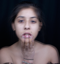
I placed two images on top of eachother, one with and one without the hand, making sure that the images were kept in the same position for when i edited, and the opacity tool helped me align the images.
|
I then used the eraser tool to keep just the fingers from one image on top of the face, therefore not covering the upper chest area
|
I realised the image I chose had a piece of clothing in the corner, and i did not want to crop it, so I copied the same area from a different image that wasnt concealed by clothes, and layered it on top and blended it into the final image.
|
|
I really like this final image; it looks simple but was difficult to create. However, I still think that this image in this way could be better; possibly including more of the hand in the image, so that the models wrist and arm is their neck and the models knuckles are seen. |
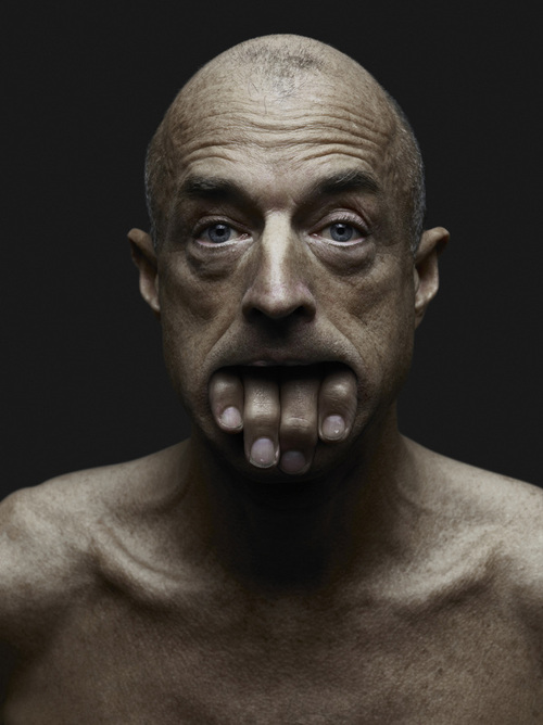
Experiment 3.
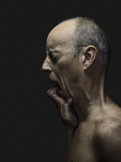
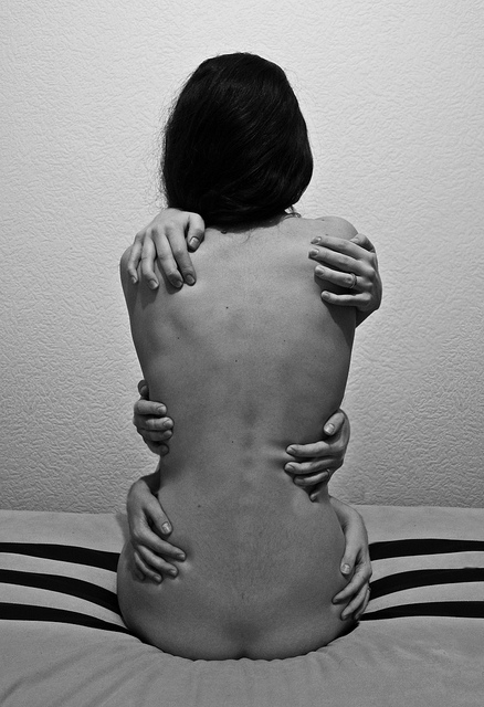
This image does not look photoshopped to me, it looks like the model is really flexible himself.
Nevertheless, I like the idea of the hand coming from behind the model, and I want to create my own idea from this.
I want to try pulling the models hair as an inspiration of this idea.
|
I really like this image, though I realised that the hand should be fully seen and I realised it should be more personal; the hand should be the same skin colour as the model. |
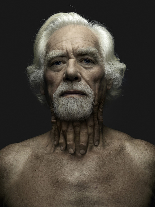
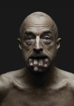
Experiment 4.
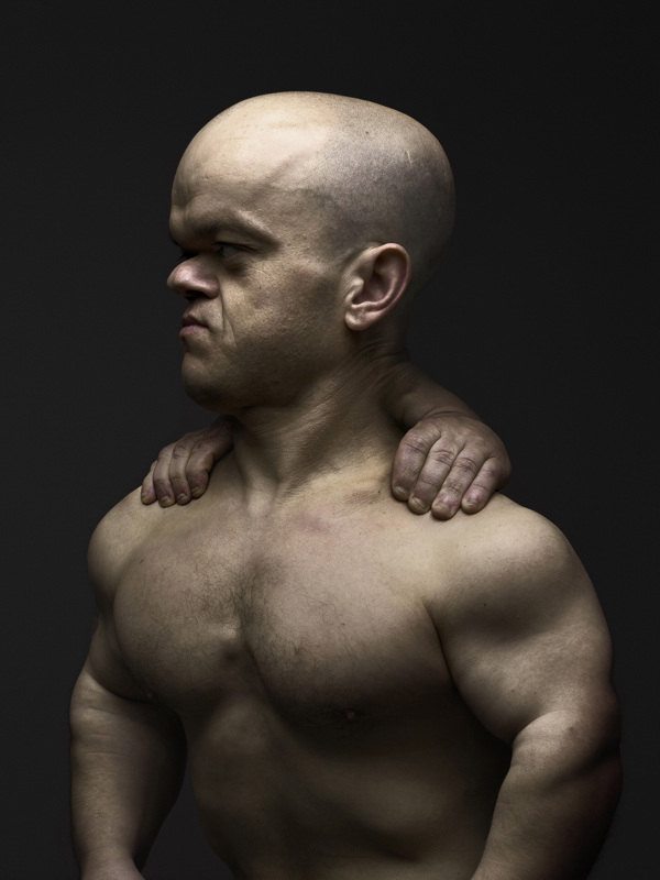
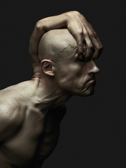
This image, to me, makes me think of how I can slightly change this style, so that the hand isn't coming out of anything, but rather replacing something.
I want to have the arm and hand as the neck of the human supporting the head.
|
I like this experiment the most out of all of them because I feel as it was my own idea it was the most successful because I was doing what I wanted to do rather than work solely in the same style as the photographer I had chosen. This image to me, also seems the most surreal because whilst Babak hosseiny's work is surreal due to its deformitive styles, this is surreal due to the replacement of natural things. |
SURREAL EXPERIMENTS.


I like these images because they are all unusual in their own ways, and it creates their atmospheric effects; they all seem slightly distorted in their unusual positioning and props, but there is something also so peaceful and this is probably the black and white hue of all the images. I want to work in this style and achieve my own surrealist images.
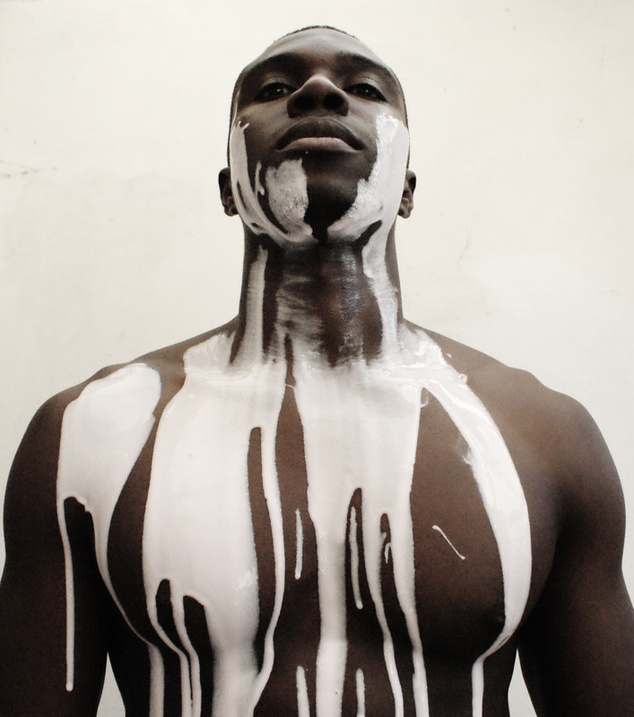
Dripping.
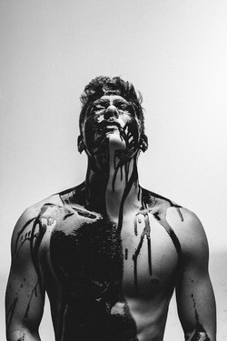
I chose to start off with this image as I felt that the composition swell as the material used looked really interesting. It looks so simple, but you are left to question why this is so and this can be considered surreal because it is not easily explained.
I want to try and replicate this image and see what sort of meanings and tones I can get from doing so.
|
This shoot was interesting- like the image I was replicating I chose to create contrast in the image but opposite to the original. I chose to put a lighter substance on a darker person, just to see if it would make any sort of difference. I do not think I will carry on with this idea however, because it doesn't have enough depth to be surreal. As I tried to look for some sort of tone and mood and meaning from this shoot, I didn't find any other than the fact that i was putting a thick liquid on somebody. |
CARNIVAL MACABRE.

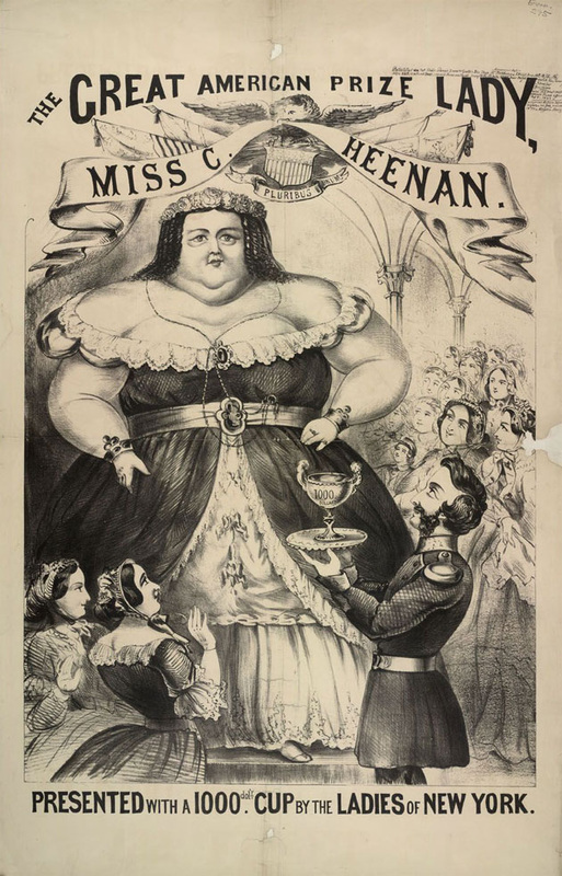
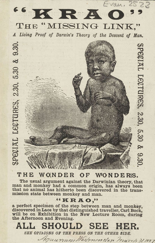

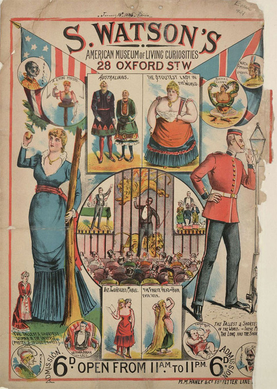
This collection of images are not from one particular photographer; they are a range of ideas that I feel as though I can use for inspiration to create my own macabre images to create an eerie atmospheric effect. I chose to follow the path of surrealism in a more focussed manner, meaning that I had a collection from a theme or genre as my final piece due to the idea that I didn't think that the work I was previously experimenting conveyed much of an atmosphere or even a point to it.
I have chosen this image as a source of inspiration as to how I would like my final images to be structured in terms of the positioning of the model and the lighting effects and slightly the costumes shown here.
This is because I like how the positioning shows control in the photograph whilst portraying something rather weird, and therefore slightly surreal.
The grungey effect shown here has inspired me to make my victorian styled circus characters look slightly grunge-like at the same time.
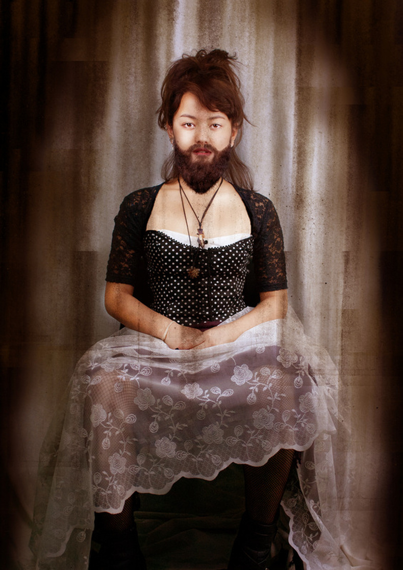
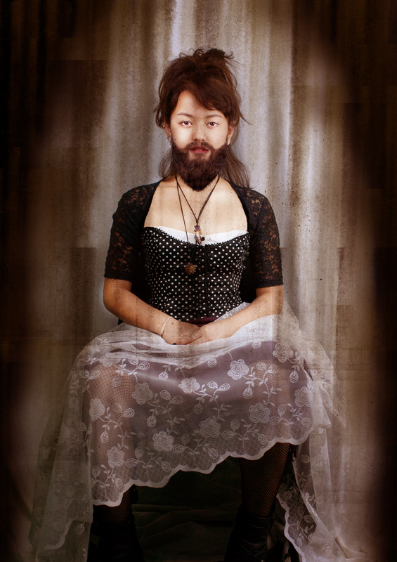
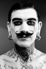
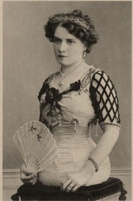
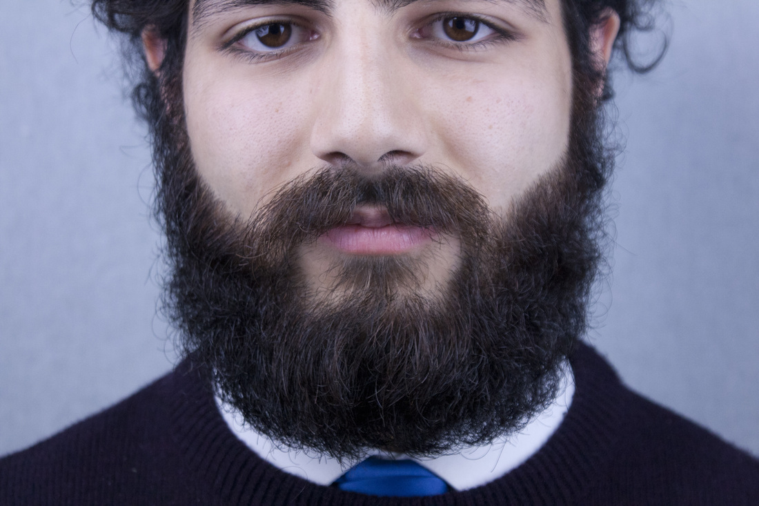
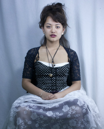
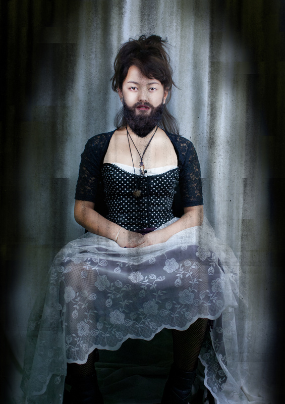
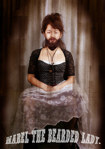
The Bearded Lady.
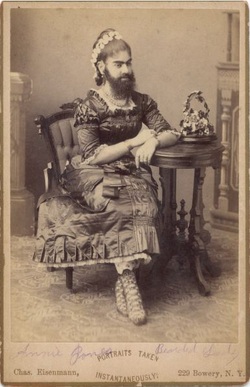
'These women have long been a phenomenon of legend, curiosity, or ridicule.'
I like the idea of integrating the role of a bearded lady in my final piece, as due to its subverted nature (a female with a masculine trait) it is considered rather surreal and therefore including it in this exam piece will benefit in contributing to a sense of atmosphere because as a collection, my final piece will contain many different roles of people and this can be seen as surreal.
|
|
|
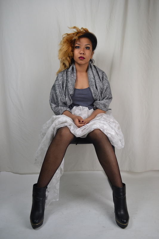
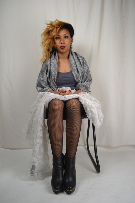
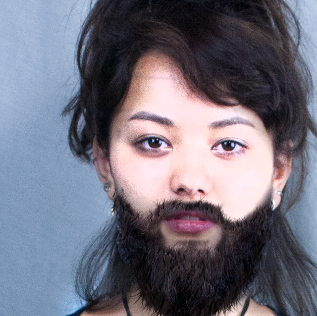
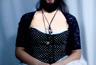
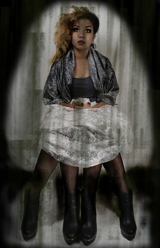
When approaching the role of the bearded lady I originally wanted a model who had a lot of hair, because therefore it would seem more obvious to have a woman with a lot of hair, who also has a beard. However, after I did my first shoot (left) I realised that perhaps whilst tackling the idea of a woman with a beard, it would possibly be more suitable to use a model that is more of a girly girl (right), thus when I apply the beard to the face the contrast of a highly feminine look with the masculine persuasion added in, it results in a higher form of surrealist nature.
|
|
A bearded lady is quite uncommon in modern times, therefore I needed to be able to photoshop a beard onto my female model. I did a photo-shoot with someone who had the most intriguing facial hair and this helped getting closer towards my final goal as if I were to just create my own beard using paintbrush tools only, it would not be as satisfactory. |
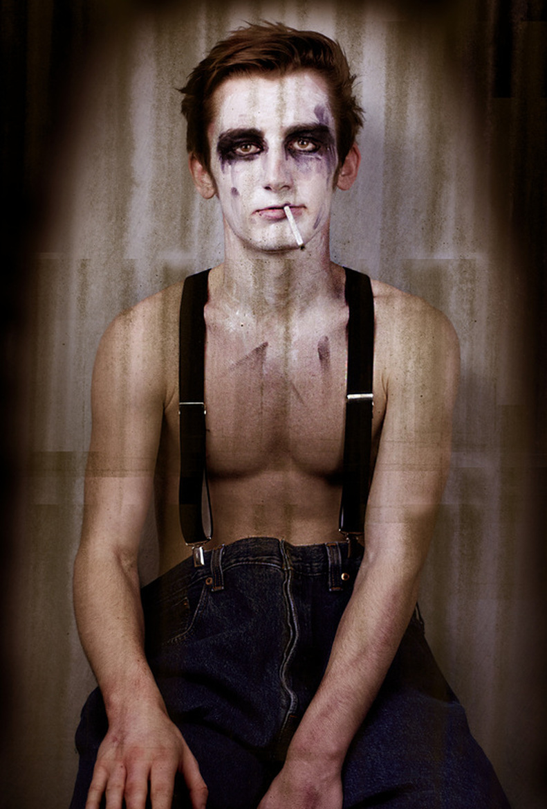
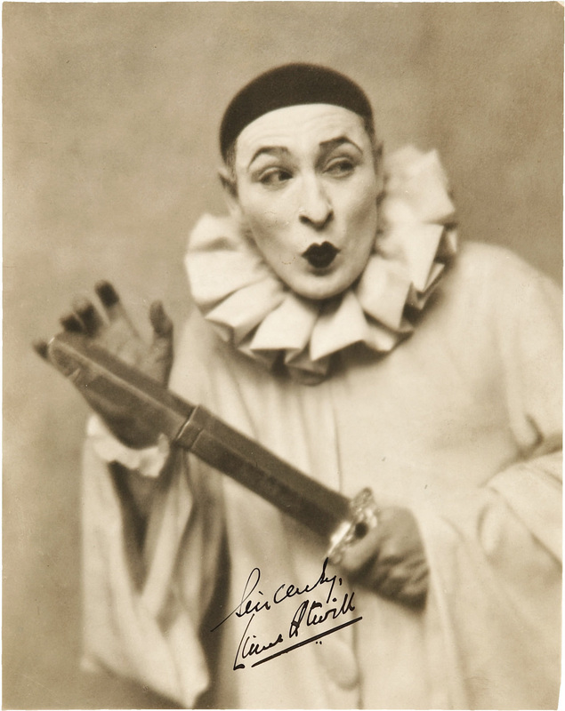
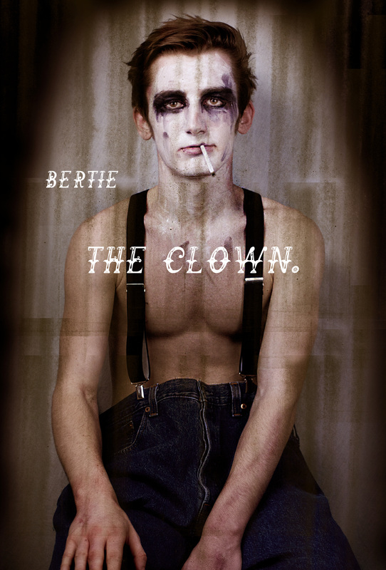
The Clown - off the clock.
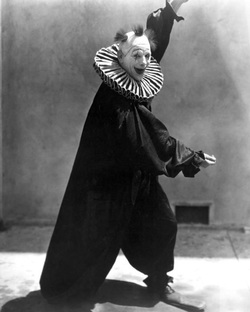
'A clown is a comic performer who employs slapstick or similar types of physical humour, often in a mime style.'
However, I feel that if I were to go down this route, i would be portraying comedy, rather than surrealism, and therefore I want my clown to be the aftermath; the 'off the clock clown', showing the clown when he removes his costume and what he might really be like under all that hyper activity and endless foolery as this seems more surreal due to the contrast in the natures.
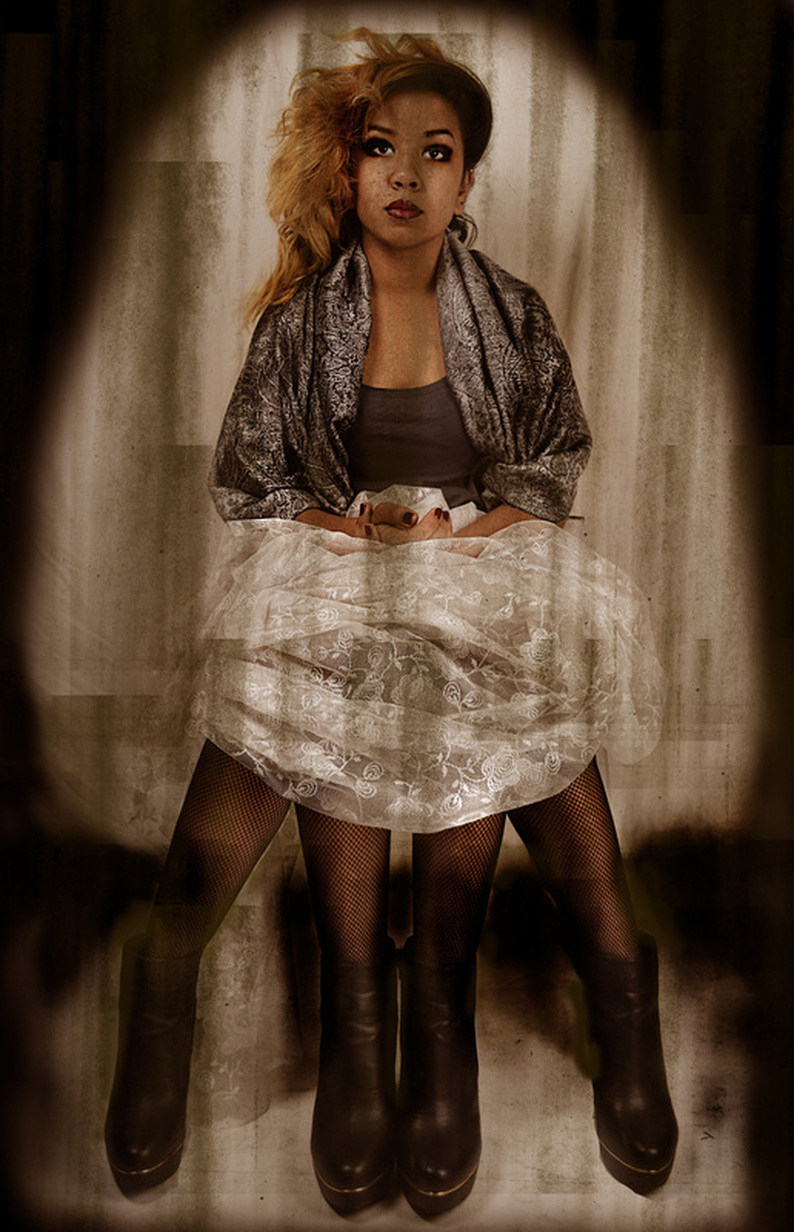
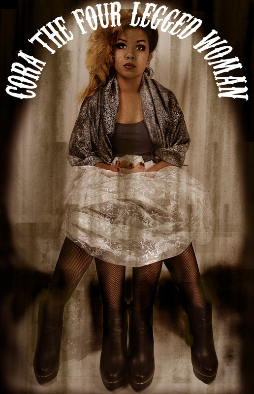
The four legged woman.
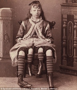
'She had two separate pelvises side by side from the waist down, as a result of her body axis splitting as it developed.'
This is highly considered as something surreal due to the strange and unnatural idea of it. I want to create my own four legged woman but perhaps make her a little bit more feminine, and a little bit more of a woman rather than a young girl.
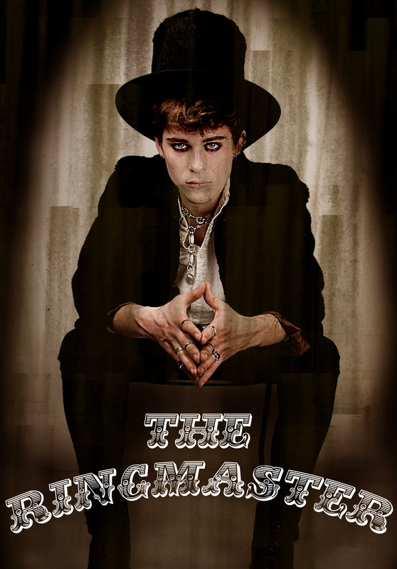
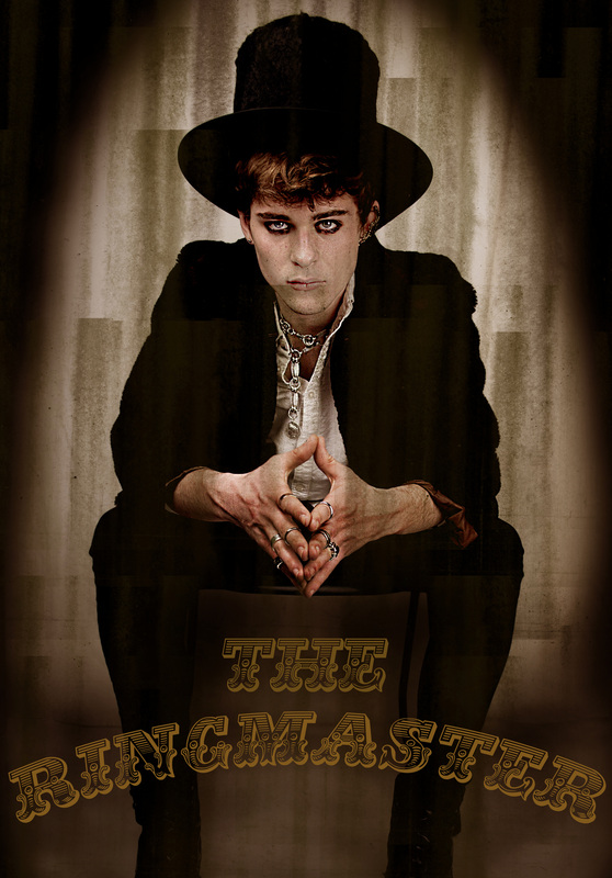
the ringmaster.
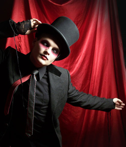
The ringmaster is the integral part of the circus as he is the man who introduces all the acts and is the most seen person on stage because of this - he is the leader of the circus.
Because of this, I would like my ringmaster character to show his powerful nature; this is through the costume and facial expression and look.
I want my ringmaster to convey a slightly witty feel in his face whilst showing an eerie and grunge look to himself, whilst portraying his sense of dominance, so that he looks as though he is the leader of the weirdoes at the carnival.
EDITING TOWARDS FINAL PIECE.
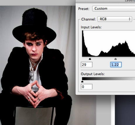
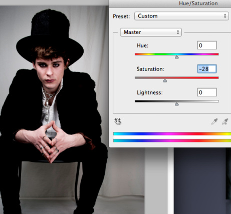
The Ring Master.
|
|
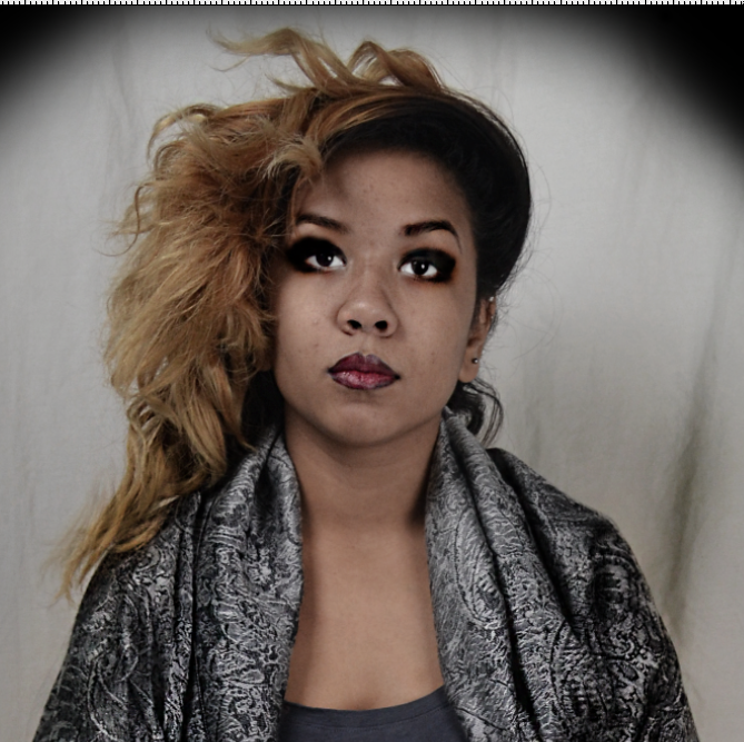
I started off by choosing the image that I felt portrayed the most mysterious yet controlling look. From this I changed the levels, curves and saturation, to start off in the eerie and antique style that I want my final images to look like.
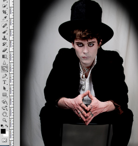
In my further editing, I wanted to do something that would make the model seem like a weird, stereotypical macabre ringmaster. By using the dodge and burn tools I was able to make his arms and hands look older and his skin looks pale and lifeless in the face. However, I dodged the whites of the eyes so that he looks more alert and controlling as the eyes are one of the things that are spotted at first glance, so I thought that if this was the case for this image, how can I create a look that is strange, yet shows dominating control like his role portrays.
|
Because I want my final images to result as slightly vintage - gaining inspiration from the idea of the victorian carnival macabre I thought that if perhaps I made these images look like vintage yet slightly gothic portrayals of these circus characters, then I think this ambience of the images would aquire a surreal tone.
Because of this, I chose to download a paintbrush pack that makes the images look old and worn out, whilst still looking high on contrast which shows a modern touch to the vintage look I want. |
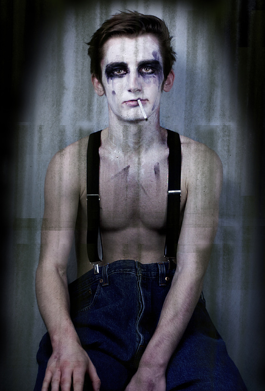
The Clown - Off the clock.
|
|
|
Like with my previous editing, I changed the contrasts and clouding of this clown image so that it can contribute to the slightly gothic/vintage stye I am going for.
Due to the fact that he is the 'off the clock' clown, and his makeup will be messy, I felt that my editing the eyes to show a contrast in the darker and lighter areas will portray the look I am going for, just like with the ringmaster editing beforehand. Using the dodge and burn tools I was able to do this.
|
I then decided that I wanted to paintbrush roughly around the models, because I felt that it highlights the model more and looks vintage in a sense. I chose to do it roughly because it creates the worn out look I want to achieve.
|
I then, much like with the previous editing, used the paintbrush tools to create this grunge-like, worn out tone to the final image.
|
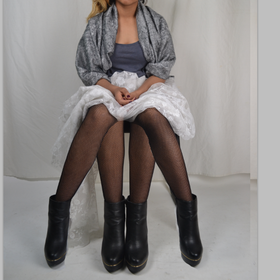
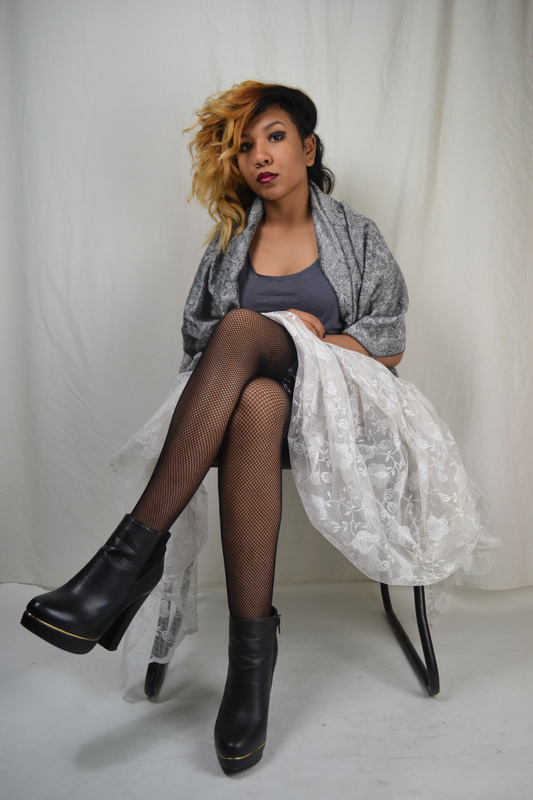
the Four Legged Lady.
|
|
I chose the two images that I wanted to use for the final image, and layered them on top of each other, using the opacity tool to help me line up the two images properly. |
|
|
|
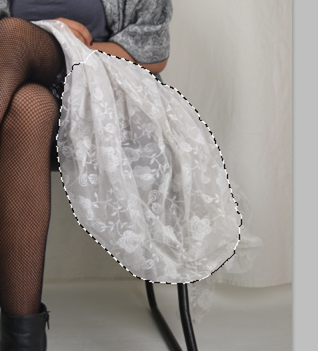
Using the eraser tool I was able to rub out the top layer ( in between the models legs) so that the legs that are positioned together could be seen, hence, four legged woman. However I realised that I should have covered the legs more because it looks really obviously photoshopped and not satisfactory enough because it looks really obvious that the legs should not be there. Therefore I chose another image from my shoot where the material for the dress was clumped together and visibly shown. I used the wand brush tool and selected a part of the material and copied it to the image as seen below.
|
|
|
I then merged the layers so that When i applied the brightness and contrast tool to the image, it would work on the whole image and not just certain layers, meaning it would all look the same tone.
I then used the dodge and burn tools on the face, and I think this makes the model look slightly dead, but a bit strange at the same time, and swell as the idea of the four legs, it helps to create the surreal look about the character in more ways than just one.
|
I then roughly painted along the outside of the frame to create the vintage look and feel.
|
I then used the rusted paintbrush tool to create the final outcome of the image.
|
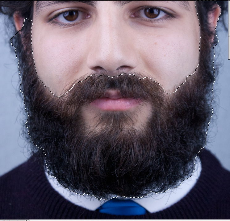
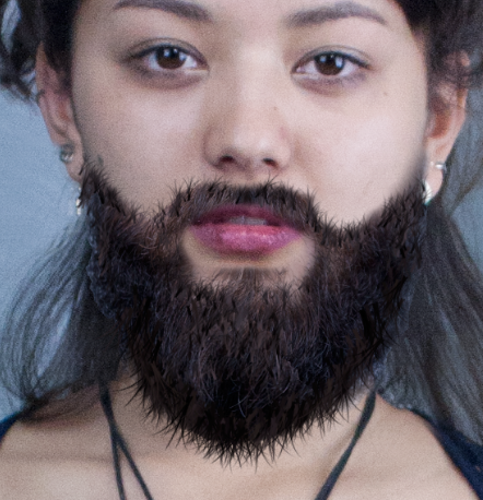
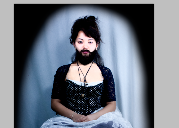
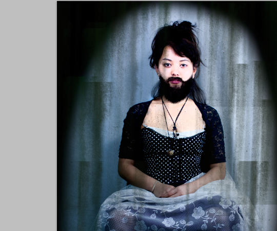
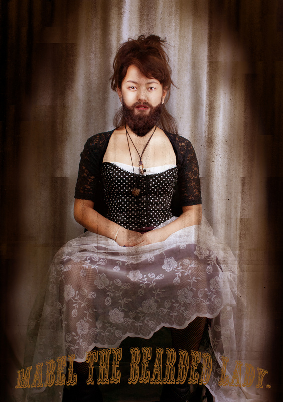
the bearded lady.
I have chosen these two images to use in the process of making my final image of the bearded lady.
|
|
|
|
|
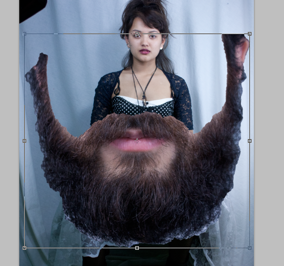
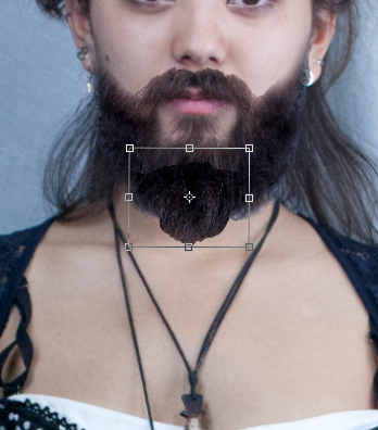
Firstly, I made a selection of the beard off of the male model, and pasted it onto the face of the female model. I scaled it to size and made sure it fit the shape of the models face.
|
|
|
I then erased any parts that were not needed and selected another section of the beard and pasted it onto the model to make the beard longer. I then selected a paintbrush tool shaped like a few blades of grass to use on the model to make it look real and less of a copy and paste selection.
|
|
|
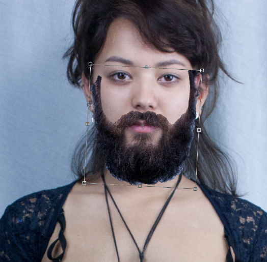
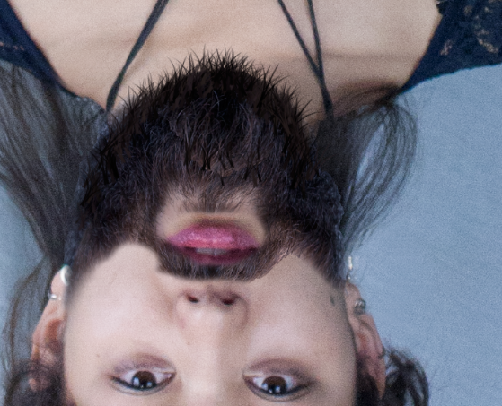
In order to use the brush the surround the whole beard, I had to rotate the image 180° so that i could use the brush along the bottom of the beard. Then i turned it back to normal and went along the top, also adding the paintbrush to any other parts that may have needed filling. After this I used the dodge tool to lighten the models face, to sow a difference between the dark facial hair, and the lighter skin colour making her look more pure and therefore more feminine.
|
|
|
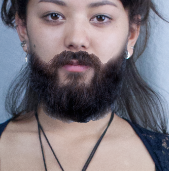
I also had to remove parts of the clothing that i did not notice where there before, like the little threads sticking out of the clothing near the models shoulders. I used the healing brush tool so get rid of this. I then again, painted around the edge and used the rusted brush tool to create the final look.
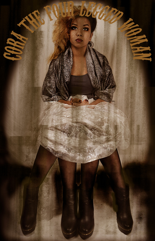
The Tones.
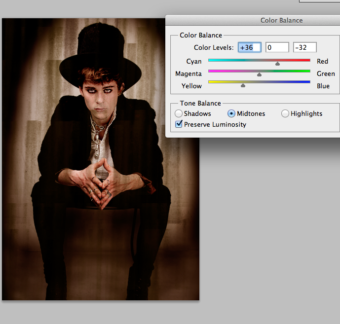
|
I then realised the tones that are a part of vintage photographs. In the victorian period, where I gained some of my inspiration from, the photography was in sepia tones, therefore I experimented to see whether this tone could be incorporated into to final images to make them better. On photoshop I used the colour balance tool and enhanced the yellow and red tones in the images, thus creating an orange tinge and therefore a sepia effect. I then tried this on all of my other final images, and I found that I prefer the sepia tinted ones more than the previous ones because they link more to a vintage style and my sources of inspiration - victorian freak show and the carnival macabre styles. |
|
|
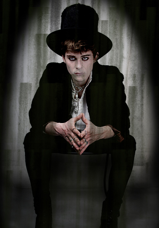
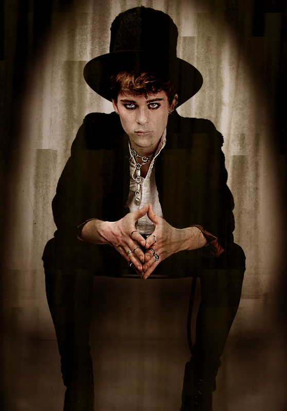


I highly prefer the use of the sepia tones in the images rather tun the blue undertones looks they had before. Due to is close link with the vintage style I am more satisfied with this newer outcome than the previous.
Incorporating Text?
I then wondered whether or not I could turn my old styled images into my own posters, much like the carnival and victorian freak shows themselves require. Using photoshop I was able to use circus fonts and apply them to suit the tone of the character in the image, as well as make them look carnival-esque.
I knew that due to the sepia toning in the images, I would only be able to do orange tinted text, or even white. I experimented with both and using the text warp tool I was able to create the effects such as arching and stretching vertically and horizontally.
I knew that due to the sepia toning in the images, I would only be able to do orange tinted text, or even white. I experimented with both and using the text warp tool I was able to create the effects such as arching and stretching vertically and horizontally.
|
|
|
|
|
|
|
|